HEY FRIEND! I'm Kara
I'm so glad you're here on my little corner of the internet where I share all things business & design. Palme Design Co. is a studio focused on website + branding design for photographers and creatives.
January 29, 2026
written by:
Your website is supposed to be your hardest-working employee.
The one working 24/7, answering questions, building trust, and guiding dream clients toward that inquiry form, without you lifting a finger.
But when certain website design mistakes creep in, your site can quietly start doing the opposite. Instead of helping, it confuses. Instead of building trust, it creates hesitation. And instead of booking inquiries, it sends potential clients clicking away to someone else’s site.
In this post, we’re breaking down:
- The most common website design mistakes I see creative entrepreneurs make
- Why these website design mistakes hurt your client experience
- How to fix them without redoing your entire website
If your inbox feels quieter than it should, there’s a good chance one (or more) of these website design mistakes is to blame.
Website Design Mistake #1: No Clear Call-to-Action
One of the biggest website design mistakes is also one of the easiest to fix.
Imagine walking into a beautiful boutique. The space is stunning, the vibe is perfect… but there’s no checkout counter. No sign telling you how to buy. No direction at all.
You’d probably admire everything—and then leave.
That’s exactly what happens when your website doesn’t have a clear call-to-action.
When visitors don’t know what to do next, they won’t guess. They’ll bounce.
Why this website design mistake matters
A lack of clear direction creates friction. Dream clients may love your work, but uncertainty kills momentum. Confused visitors don’t inquire.
How to fix this website design mistake
- Every page should guide visitors to a next step
- Use clear, action-oriented buttons (not just “Submit”)
- Repeat your main call-to-action multiple times per page
- Make your inquiry button easy to find—especially above the fold
Your website shouldn’t whisper what to do next. It should gently—but clearly—guide people forward.
Website Design Mistake #2: Overloaded Design
Creatives love beautiful things. Fonts, textures, colors, graphics, flourishes—we want it all.
But overloaded design is one of the most common website design mistakes I see.
When a website feels busy, cluttered, or chaotic, visitors don’t know where to look. Their brains work overtime trying to process everything, which leads to overwhelm.
And overwhelmed people don’t inquire.
Why this website design mistake matters
Visual clutter reduces clarity. When everything is emphasized, nothing stands out. Instead of focusing on you and your services, visitors feel distracted.
According to usability research from the Nielsen Norman Group, simpler layouts improve comprehension and decision-making by reducing cognitive load. Clean design isn’t boring, it’s effective.
How to fix this website design mistake
- Embrace white space (it helps content breathe)
- Stick to 2–3 fonts max
- Limit your color palette and use it consistently
- Remove anything that doesn’t serve a purpose
Clean design builds trust. Strategic restraint is a sign of professionalism.
Website Design Mistake #3: Generic Messaging
This website design mistake is sneaky—and incredibly costly.
If your website copy could belong to any creative business, it’s not doing its job.
Phrases like “capturing your memories” or “creating beautiful experiences” sound nice, but they don’t differentiate you. Dream clients want to know why you—not just what you do.
Why this website design mistake matters
Generic messaging fails to create connection. When visitors don’t see themselves reflected in your words, they move on to someone who feels more aligned.
How to fix this website design mistake
- Speak directly to your ideal client
- Use language that reflects your values, personality, and approach
- Share what your process is actually like
- Write like you talk—warm, conversational, human
Specificity builds trust. When your words feel personal, clients feel seen.
Website Design Mistake #4: Confusing or Hidden Navigation
Another major website design mistake is making visitors work too hard to find information.
If your services, portfolio, or inquiry form are buried several clicks deep, people won’t stick around long enough to find them.
Attention spans are short. Friction kills curiosity.
Why this website design mistake matters
Confusing navigation breaks momentum. When visitors can’t quickly find what they need, excitement turns into frustration.
How to fix this website design mistake
- Keep your main navigation to 5 items or fewer
- Prioritize essential pages: Home, About, Services, Portfolio, Contact
- Make your inquiry button visible in both the header and footer
- Use clear, intuitive labels (no guessing required)
Your navigation should feel effortless, not like a scavenger hunt.
Website Design Mistake #5: Ignoring Mobile Design
This website design mistake alone can cost you a lot of inquiries.
More than half of website traffic comes from mobile devices. If your site only looks good on desktop, you’re losing clients. Full stop.
Tiny text, hard-to-tap buttons, slow load times… these are instant turn-offs.
Why this website design mistake matters
Mobile visitors are often browsing quickly. If your site feels clunky or frustrating, they won’t try again later, they’ll just leave.
How to fix this website design mistake
- Check every page on your phone
- Make sure text is readable without zooming
- Ensure buttons are large enough to tap
- Optimize images for faster load times
Platforms like Showit make mobile design easier—but it still requires intention.
Why Website Design Mistakes Cost You More Than You Think
You might be wondering if these website design mistakes really matter.
They do.
Your website is often your first impression. And in creative industries, first impressions carry a lot of weight.
When your site feels confusing, overwhelming, or generic, dream clients won’t wait around. They’ll simply move on.
But when your site feels clear, intentional, and strategic, visitors feel:
- Safe (you look professional)
- Seen (your words resonate)
- Excited (your work feels aligned)
That’s when inquiries happen.
How to Start Fixing Website Design Mistakes Today
The good news? Fixing these website design mistakes doesn’t require a full rebrand or total overhaul.
Start small:
- Add a clear call-to-action to every page
- Simplify your design and remove clutter
- Rewrite your homepage copy with your ideal client in mind
- Streamline your navigation
- Test your entire site on mobile
Tiny changes can create major shifts.
And if you’re already making updates, it’s worth checking small details too, like keeping your footer year current so your site always looks maintained. I shared a quick tutorial on how to automatically update the copyright year in your website footer so you never have to think about it again:
Pretty design matters. But strategy is what makes a website work.
If your site isn’t bringing in the inquiries you want, chances are one of these website design mistakes is standing in the way. The fix isn’t always more content or more marketing, it’s often clarity.
Your dream clients are out there. Let’s make sure your website is ready to welcome them in.
Kara Weech
HEY FRIEND!
I'm Kara
I'm so glad you're here on my little corner of the internet where I share all things business & design. Palme Design Co. is a studio focused on website + branding design for photographers and creatives.
let's work together
Unlock the potential of an irresistible, strategic website and branding that will leave potential clients lining up to work with you.
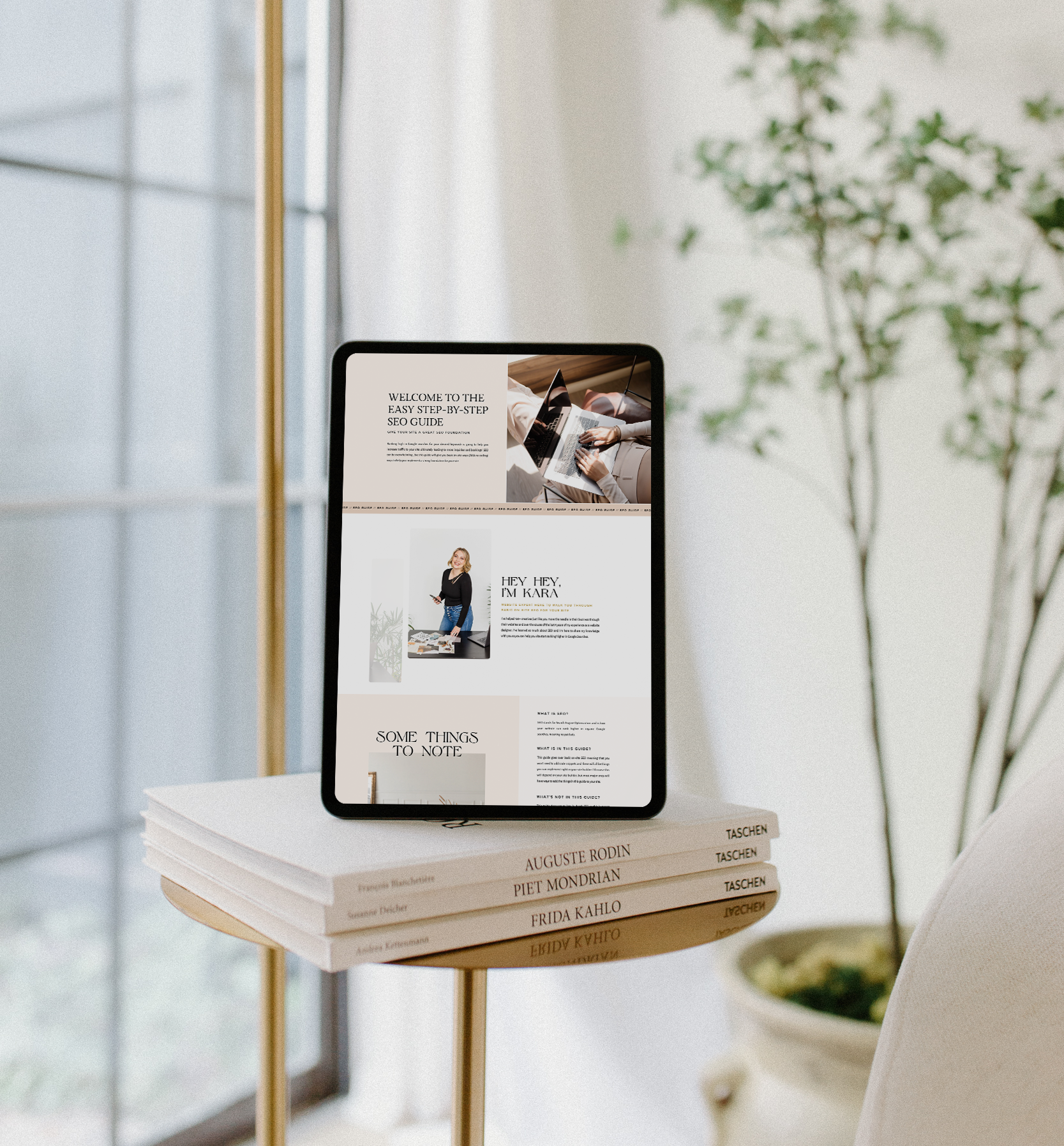
Inside this guide I will give you actionable, step-by-step tips that you can implement in your website right away to lay a strong SEO foundation and start seeing better SEO results so you can get organic leads to your site so qualified potential leads can easily find you on Google.


