


Choosing the right colors for photography logo design is not just about what looks pretty.
Here’s the truth no one says loud enough:
Your dream clients decide how they feel about you before they ever scroll your portfolio. Before they browse your portfolio or see your pricing. They feel your brand first, and your colors set the tone.
If you’ve ever wondered why some photographers seem to effortlessly attract aligned, excited, ready-to-book clients while you’re sitting there like “hello??? I am talented too???” … branding plays a bigger role than you think.
So today, I’m walking you through five strategic color directions for your photography logo.
And *bonus!* I created a mood board from images that showed up when searching each style on Pinterest so you can actually see what these styles look like in real life. Because color swatches alone do not tell the whole story.
Let’s get into it.
Why Colors For Photography Logo Design Matter More Than You Think
Before we dive into palettes, let’s zoom out for a second.
Color psychology is real. It influences trust, emotion, and even purchasing behavior. If you’re curious about the research side of it, this article from Verywell Mind breaks it down beautifully:
But let’s make this practical.
Your colors for photography logo design influence:
- Whether you look “premium” or beginner
- How you feel to your dream client (adventurous, luxury, artsy, etc.)
- If you attract timeless couples or trendy ones
- First impressions of your pricing level
If you’re here, you already know you care deeply about this. You don’t just want pretty.
You want intentional, aligned, beautiful and strategic. And that’s what we are all about around here!
So here are five directions that consistently work.
1. Romantic & Soft
If your editing style is warm, creamy, emotional, maybe a little film-inspired… this one might be you. And be fully prepared for this swoon-worthy mood board to dreamist sigh.
The Inspiration
The Color Palette
This palette feels:
- European countryside
- Heirloom
- Soft but grounded
- Intimate and nostalgic
This romantic and soft palette works because it balances delicacy with depth.
Canvas creates a warm, breathable foundation. It feels softer than white and immediately elevates the entire system. Dusty Rose and Mauve bring gentle warmth and emotion, creating that timeless, almost painterly softness. Then Emerald and Root step in to anchor the palette. They prevent it from drifting into overly sweet territory and instead give it maturity and structure.
This is the palette for the photographer whose work feels like a memory. The one drawn to garden venues, handwritten vows, layered florals, and soft golden light. It attracts couples who value sentiment, detail, and legacy over trend.
When you see this palette styled in the mood board, it becomes clear why it resonates. Linen textures. Candlelight. Blush florals against deep greenery. Nothing harsh. Nothing loud.
Romantic does not mean fragile. It means intentional softness. And in branding, softness done well reads as timeless.
2. Modern & Minimal
If you’re wanting to attract brides that crave simple, sophisticated beauty – modern minimal might be your move.
The Inspiration
The Color Palette
This palette feels:
- Calm and grounded
- Structured and refined
- Understated but confident
- Editorial without being dramatic
Minimal colors for photography logo design are powerful because they get out of the way and let your photography shine.
Blanket gives you that soft, almost architectural base. It’s not stark white. It’s intentional. Flush warms things up just enough so the palette doesn’t feel sterile. Then Freckle and Earthen bring in depth and structure — grounding tones that signal maturity and confidence. Space acts as the quiet bridge between warmth and cool neutrality.
This is the palette for the photographer who doesn’t need to shout.
It attracts dream clients who appreciate clean lines, intentional design, and elevated simplicity. The kind of couples booking modern venues, tailored silhouettes, and refined florals. It feels editorial, but approachable. Strategic, but still romantic.
And when you see it styled in the mood board, layered fabrics, structured shadows, neutral fashion, you realize something important:
Minimal is not boring but controlled. And control, in branding, reads as confidence.
3. Editorial & Luxury
If you are stepping into higher investment weddings…your brand and color palette need to step with you.
The Inspiration
The Color Palette
This palette feels:
- Sophisticated and fashion-forward
- Quietly powerful
- Structured and elevated
- Refined without being flashy
This editorial and luxury color palette works because it leans into contrast without becoming harsh.
Porcelain keeps everything luminous and breathable. It’s softer than stark white, which immediately makes it feel more elevated. Neutral adds warmth and softness, preventing the palette from feeling cold. Then Fawn introduces richness, a warm, grounded tone that signals maturity and depth. Oaken anchors the entire system with dramatic restraint, while Downpour adds that cool, editorial undertone that feels straight off a fashion set.
This is the palette for the photographer who is stepping into higher investment weddings. The one booking black-tie venues, structured gowns, curated details, and intentional styling. It doesn’t scream luxury. It assumes it.
And when you see it styled in the mood board, silk draping, sculptural florals, architectural light, tailored silhouettes, it becomes clear why this works so well.
These colors for photography logo design signal:
- Premium positioning
- Experience
- Elevated taste
- Sophistication
If your dream clients are booking black-tie venues and curated details, your brand needs to reflect that level.
4. Moody & Artistic
If your work leans cinematic, emotional, documentary…lean into it with your brand colors so that you can attract more couples that are obsessed with atmosphere, story, and feeling over perfection. If your editing style is dramatic and you try to brand yourself with light blush and beige… it will feel disconnected.
The Inspiration
The Color Palette
This palette feels…
- Cinematic and atmospheric
- Emotional and expressive
- Intentionally dramatic
- Creative and story-driven
This moody and artistic palette works because it embraces contrast and depth instead of softening everything.
Cloud offers a warm, muted base that keeps the palette grounded in romance. Olive and Midnight bring the shadow, rich, organic tones that feel forested, layered, and textured. Steel cools the warmth just enough to add sophistication, while Saccharine injects that unexpected hit of energy, a burnt, fiery accent that feels like movement, passion, and storytelling.
This is not a safe palette. It’s intentional.
It’s for the photographer whose work feels like a film still. The one who leans into blur, shadow, motion, and mood. The one whose couples are drawn to candlelit dinners, overgrown florals, textured linens, and emotion over perfection.
When you see this palette styled in the mood board, wind-blown fabric, orange florals against dark backdrops, blurred portraits, deep greens and layered light, it becomes clear why this works so beautifully.
Moody doesn’t mean dark for the sake of dark. It means depth, feeling, & artistry.
And these colors communicate that before someone sees a single photo of yours.
5. Bright & Joyful
Now let’s talk about how to draw in the bubbly couples. If your personality is warm, expressive, maybe a little playful, and those are the types of weddings you want to book more of, bright absolutely works.
But here’s the key: Bright does not mean chaotic. It means curated energy. When slightly softened, these tones feel joyful without feeling amateur.
The Inspiration
The Color Palette
This palette feels…
- Playful but curated
- Expressive and personality-driven
- Vibrant without being chaotic
- Warm, celebratory, and alive
This bright and joyful palette works because it balances energy with grounding.
Sky gives you breathing room, a soft, airy base that keeps everything feeling fresh. Lilac adds a playful femininity, while Honey and Tangerine bring warmth and sunshine into the mix. Chartreuse injects bold personality, and Deep Sea anchors the entire palette so it doesn’t float off into overstimulation.
The key here is proportion.
Used intentionally, these colors feel celebratory, not childish. Editorial, not loud. Joyful, but still elevated.
This is the palette for the photographer who thrives on connection. The one whose couples are laughing, twirling, popping champagne, and dancing barefoot in golden light. The one whose work feels like summer even in October.
These colors for your photography logo design attract couples who:
- Love personality
- Value celebration
- Want their day to feel fun and alive
And when you see it styled in the mood board, colorful florals, blue skies, movement, citrus tones, playful fashion, it makes sense why this works so beautifully.
Bright doesn’t mean messy. It means confident enough to take up space. And for the right dream clients, that energy is magnetic.
How To Choose The Right Colors For Photography Logo Design
Okay. So how do you actually decide?
Here are three grounding questions:
1. Does This Align With My Editing Style?
Your brand should feel cohesive.
Warm edits → warm neutrals.
Moody edits → depth.
Light and airy → muted softness.
If your logo colors fight your photography, something will always feel slightly off.
2. Who Is My Dream Client?
Not just “brides.”
But:
- What venues are they booking?
- What florals do they love?
- What fashion style are they drawn to?
- What brands do they resonate with?
If your dream client shops at Anthropologie and loves Bridgerton energy… romantic softness might feel aligned.
If she leans more modern luxury and city editorial… go minimal or high-contrast.
Your colors for photography logo design are a magnet.
Make sure they’re pulling in the right people.
3. Am I Branding For Where I Am, Or Where I’m Going?
This one is big. Sometimes you hesitate because you feel “not ready.” But your brand is not a reflection of your past. It is a declaration of your direction.
If you are ready to raise your prices, book higher-end clients, and step into your next level… your palette may need to evolve too. This is why we start with strategy without just picking your favorite five colors on Canva and hope for the best. You’re stepping into an era where you are magnetically attratcing dream clients, not just shooting in the dark and seeing who comes your way.
The best colors for photography logo design are not trendy.
They are aligned with your:
- Editing
- Personality
- Dream clients
- Next-level vision
And because I know swatches alone are hard to visualize, I created a full mood board for each of these five palettes. So you can see how they feel in context, with imagery, texture, styling, and real-life inspiration.
Because this isn’t about “what’s pretty.” It’s about: what feels like you, attracts your people, and helps you show up confidently.
And if your website currently feels disconnected from the level you want to book, I’d also recommend reading this guide on website design mistakes that may be costing you inquiries:
Your brand should not feel like a question mark. It should feel like a home.
Now tell me, which palette felt like you the second you read it?
Because that reaction? That’s alignment talking.

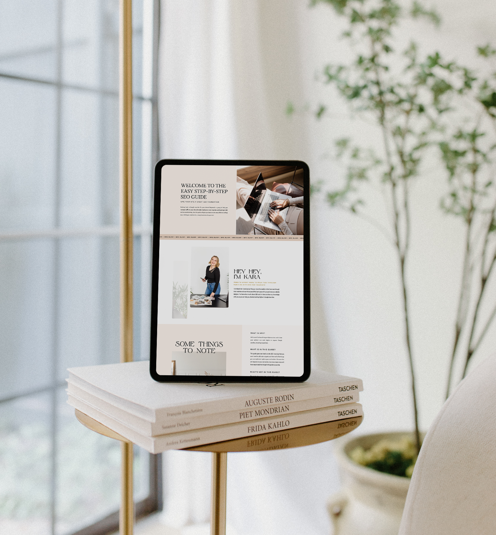
Inside this guide I will give you actionable, step-by-step tips that you can implement in your website right away to lay a strong SEO foundation and start seeing better SEO results so you can get organic leads to your site so qualified potential leads can easily find you on Google.
easy SEO Guide To help you have a good seo foundation to Get Your Site Found on Google
free download


