


Good fonts for photographers can be hard to find, and the fonts you use in your branding and on your website are doing more than you think.
Before a potential client reads a single word of your copy, your typography has already told them something about your brand. Whether you’re editorial and elevated, warm and approachable, or somewhere beautifully in between, your fonts are making that statement.
And right now? Typography is having a moment.
After years of safe, stripped-back sans-serifs dominating every corner of the internet, 2026 is the year personality came back. The fonts for photographers that are trending right now are expressive, intentional, and designed to make a brand feel memorable. This is exactly what you need when a couple is comparing ten different photographers in ten different tabs.
I love sourcing fonts from Creative Market because they have a large library of quality, affordable fonts so I’ll be focusing on fonts found there! Here’s what’s trending, what it communicates, and how to use it well.
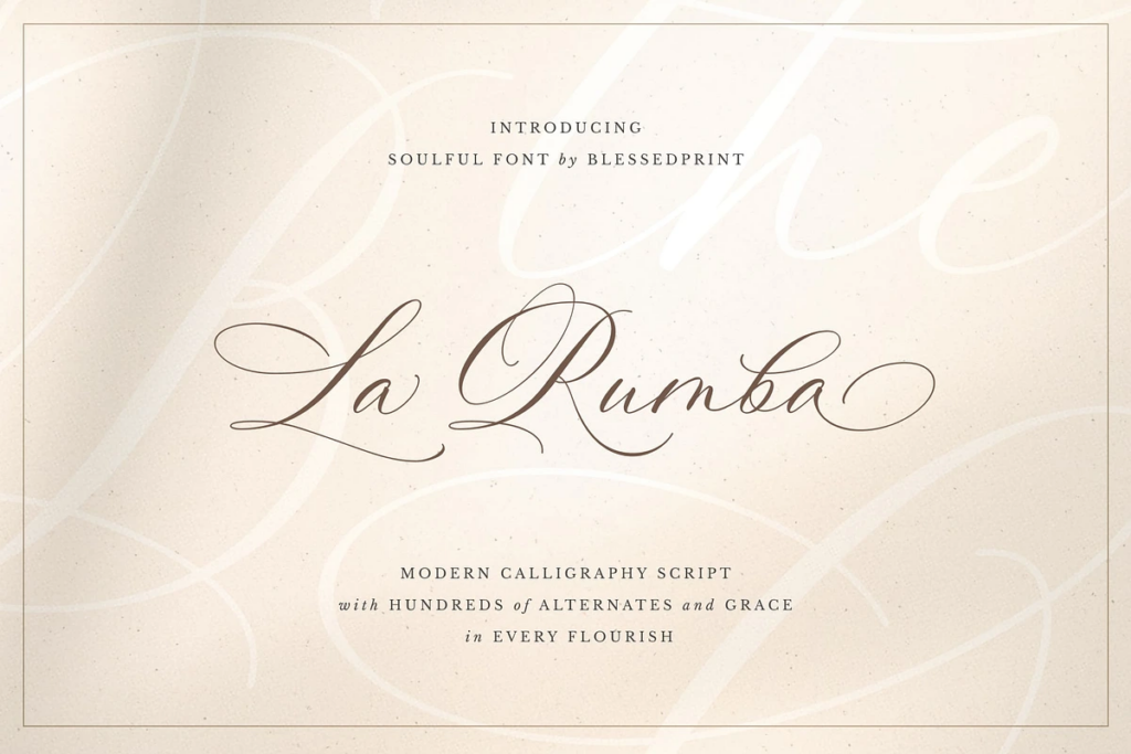
1. Timeless Serifs Are Back, And They Mean Business
If you’ve been holding onto a fun sans-serif with lots of swashes and loops paired with a thick mono-lined font because it felt fun & new while still trying to maintain some sense of elegance, 2026 might be the year you step into something more timeless.
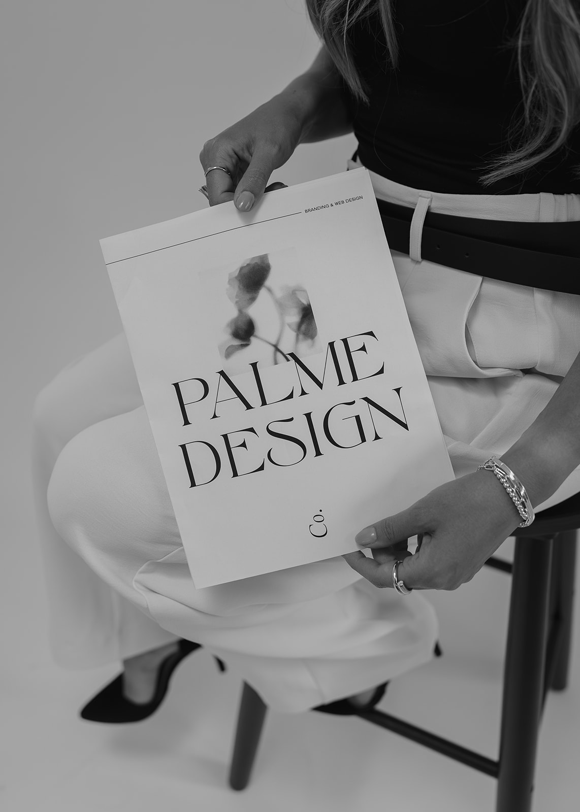
High-contrast, refined serif fonts are having a serious renaissance right now, and for high-end photographers, they are an absolute natural fit. These fonts for photographers communicate sophistication, permanence, and trust in a way that no spunky serif can quite replicate. They feel timeless, considered, and expensive.
Used well, a beautiful serif in for your headers communicates to a luxury client that you take your craft seriously, before they’ve even looked at your portfolio.
Examples of outdated fonts:

Timeless Serif Fonts to explore on Creative Market:
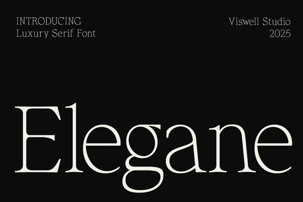
Elgane by Viswell Studio — a sophisticated and timeless luxury serif font, crafted to bring elegance and high-end aesthetics to your designs.
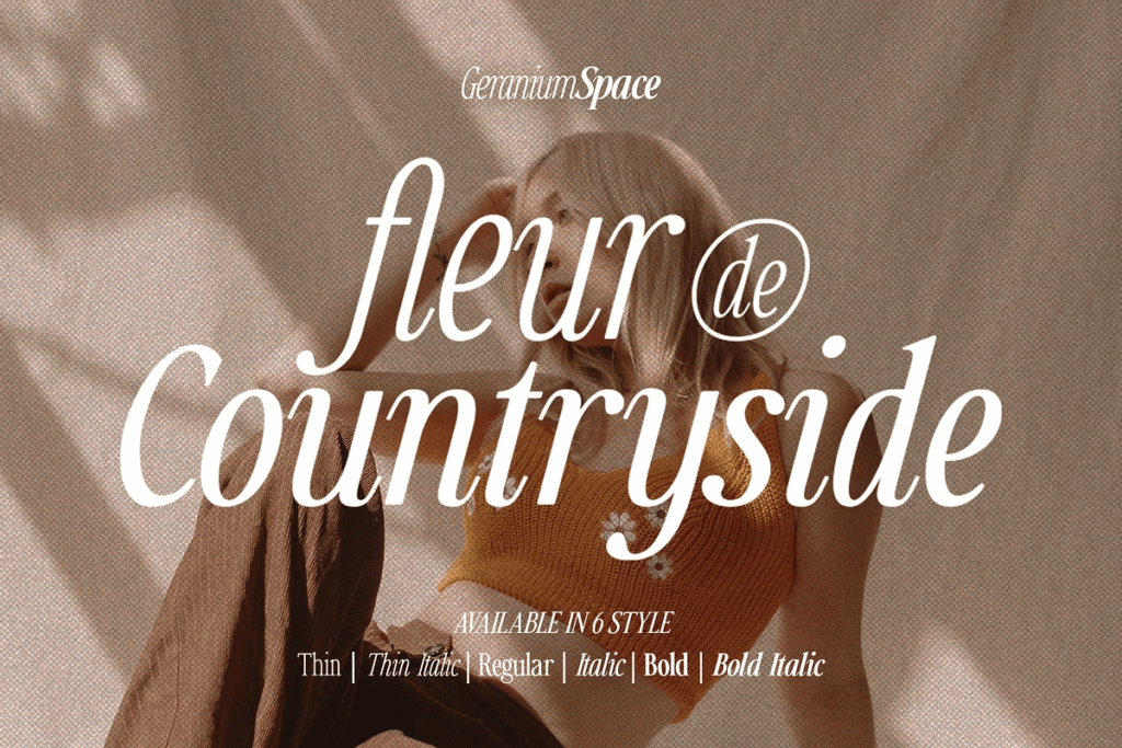
Countryside by Megi Satyo Widodo — An elegant font that offers a beautiful italic version with multiple weights for versatility.
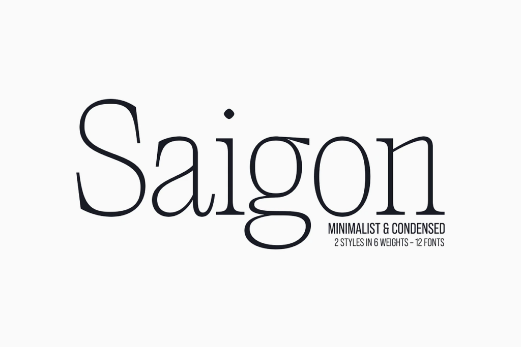
Saigon by The Paper Town — Saigon is a minimalist condensed serif. With clean lines and tight curves, its personality dwells in its simplicity making it a timeless editorial typeface.
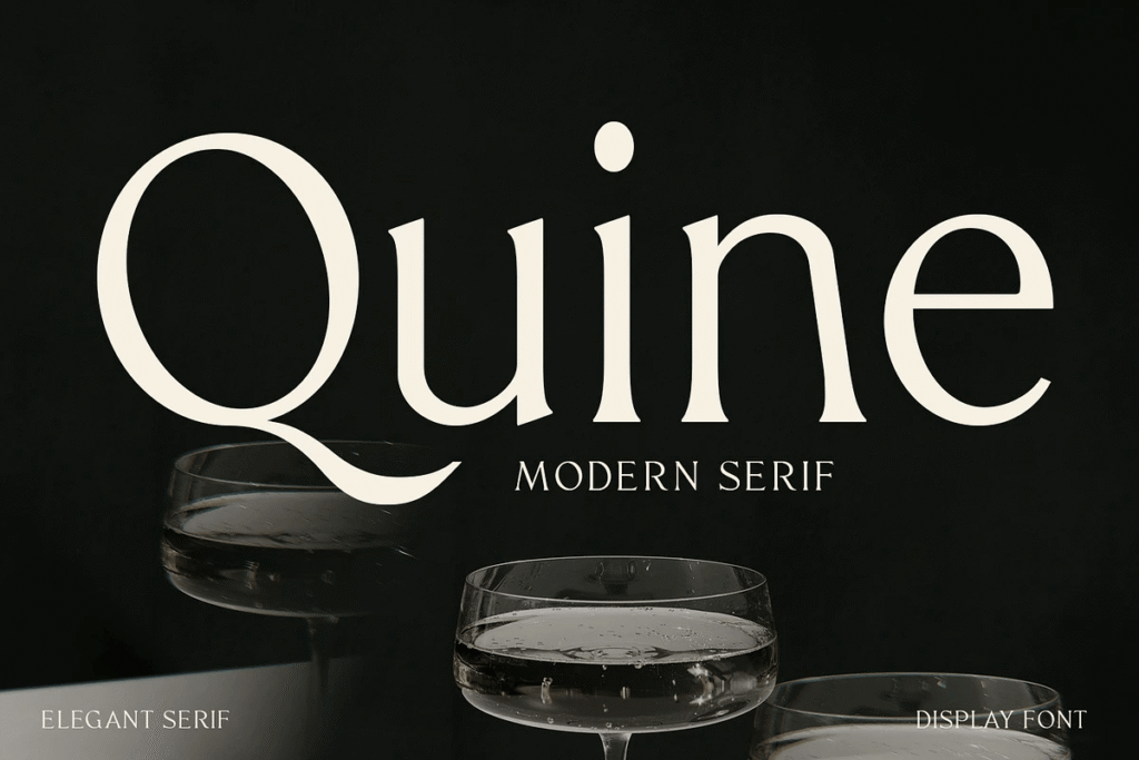
Quine by Viswell Studio — Designed with a striking balance between classic proportions and contemporary flair, Quine commands attention with its high contrast strokes, smooth transitions, and distinctive terminals.
How to use it: Pair a high-contrast serif for your headers and logo with a clean, simple sans-serif for body copy. The contrast creates a hierarchy that feels intentional and polished.
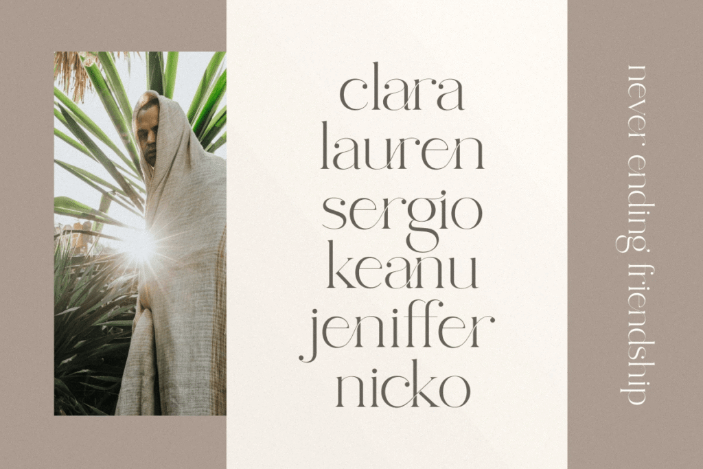
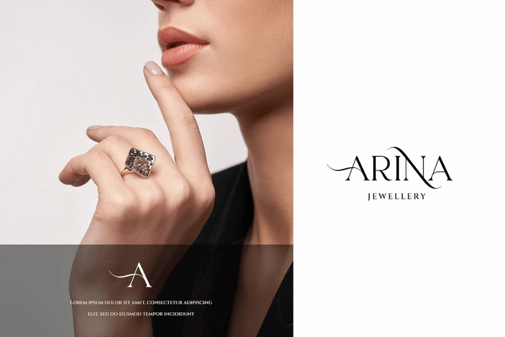
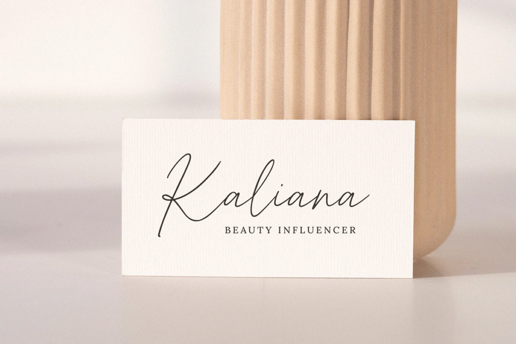
2. Mixed Font Pairings, The Art of Intentional Contrast
One of the biggest shifts in fonts for photographers right now is the move away from using a single typeface or style across an entire headline or logo. The most sophisticated websites in 2026 are using font pairings or elegant italics to create visual interest, emphasis, and hierarchy.
The key word here is complementary. This isn’t about throwing two random fonts together and hoping for the best. It’s about intentional contrast (pairing a serif with a sans-serif, or a script with something structured) in a way that creates balance and personality.
I love the look of two or three words italicised in a phrase or a script letter in a single word (typically in a logo) because it gives interest without overhwelming the eye. Elegance is all about simple beauty and using mixed font/style pairings is the perfect way to achieve that!
Fonts to explore on Creative Market:
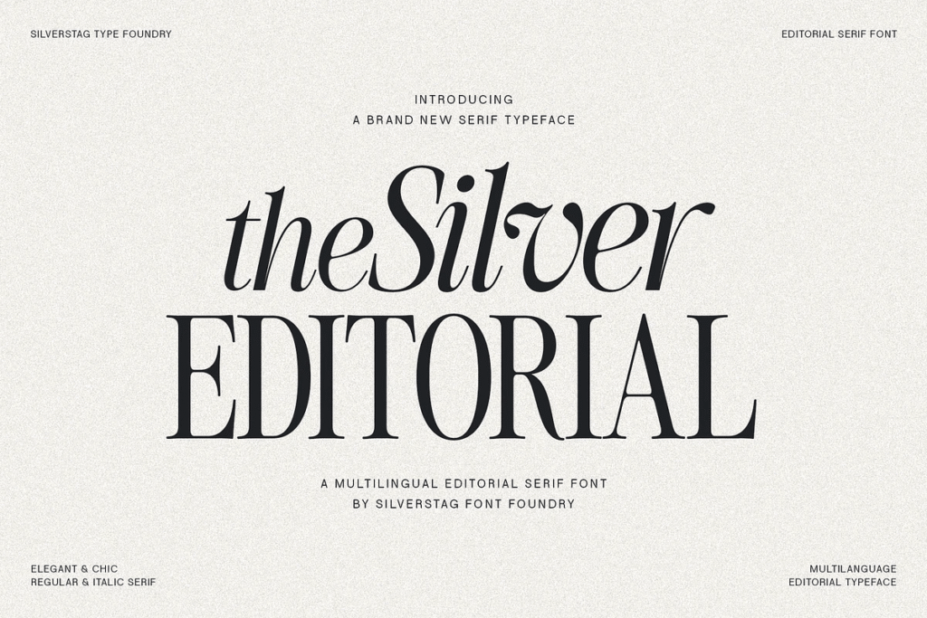
The Silver Editorial Font by Silverstag Font Foundry — This fresh editorial serif draws inspiration from the iconic typefaces of the 1980s, yet exudes an undeniably modern spirit.
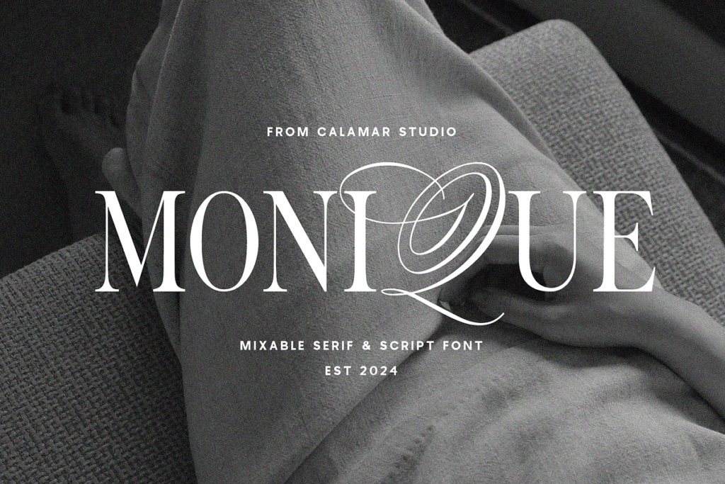
Monique Display Duo Font by Calmar Studio — Monique font is a gorgeous and luxury mix of classic calligraphy and modern serif fonts perfect for use in a logo and website headers.
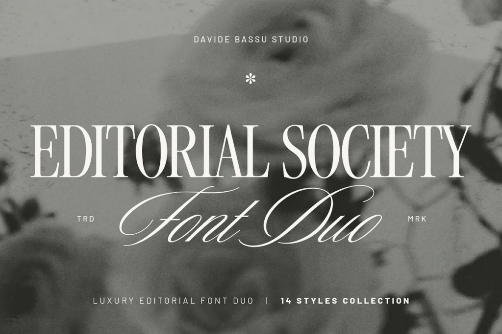
Editorial Society – Luxury Font Duo by Davide Bassu — a timeless serif paired with a refined handwritten script, designed specifically for editorial and luxury branding. Perfect for wedding photographers.
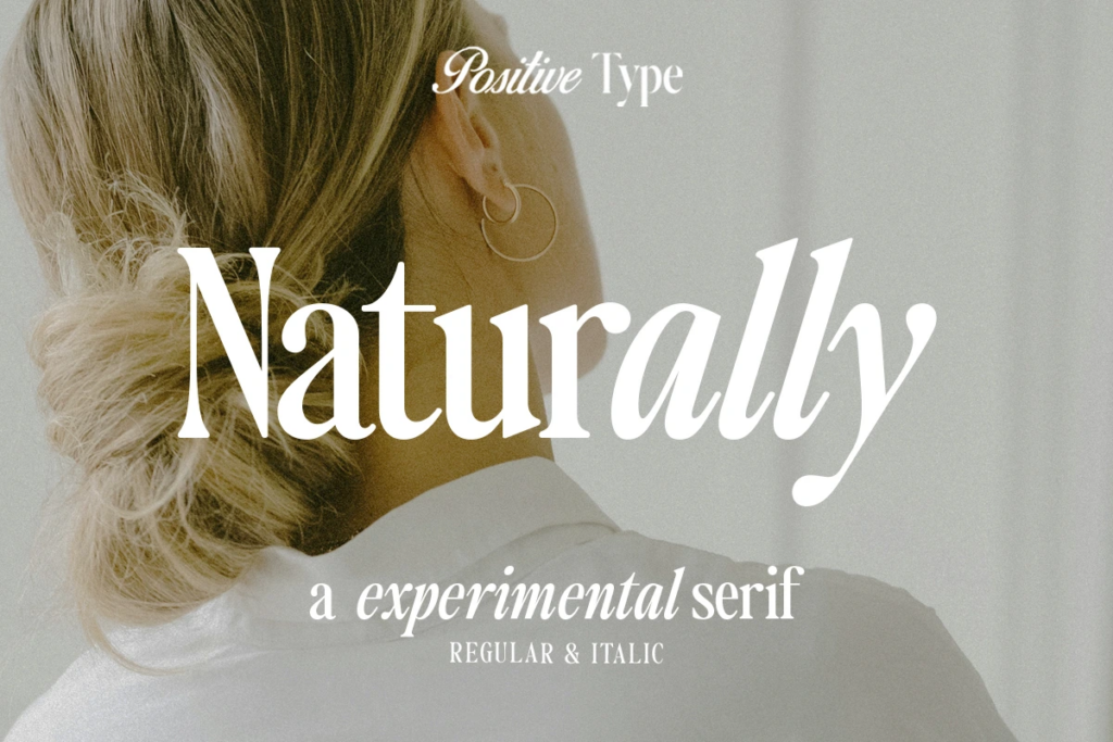
Naturally by Positive Type — a stunning typeface that combines the characteristics of sleek and exotic beautifully crafted serif fonts, making it an ideal choice for creating elegant and sophisticated designs.
How to use it: Use your script or italic accent with intention, either highlighting words in a phrase in italic to add emphasis or a letter in a logo to add texture and balance.
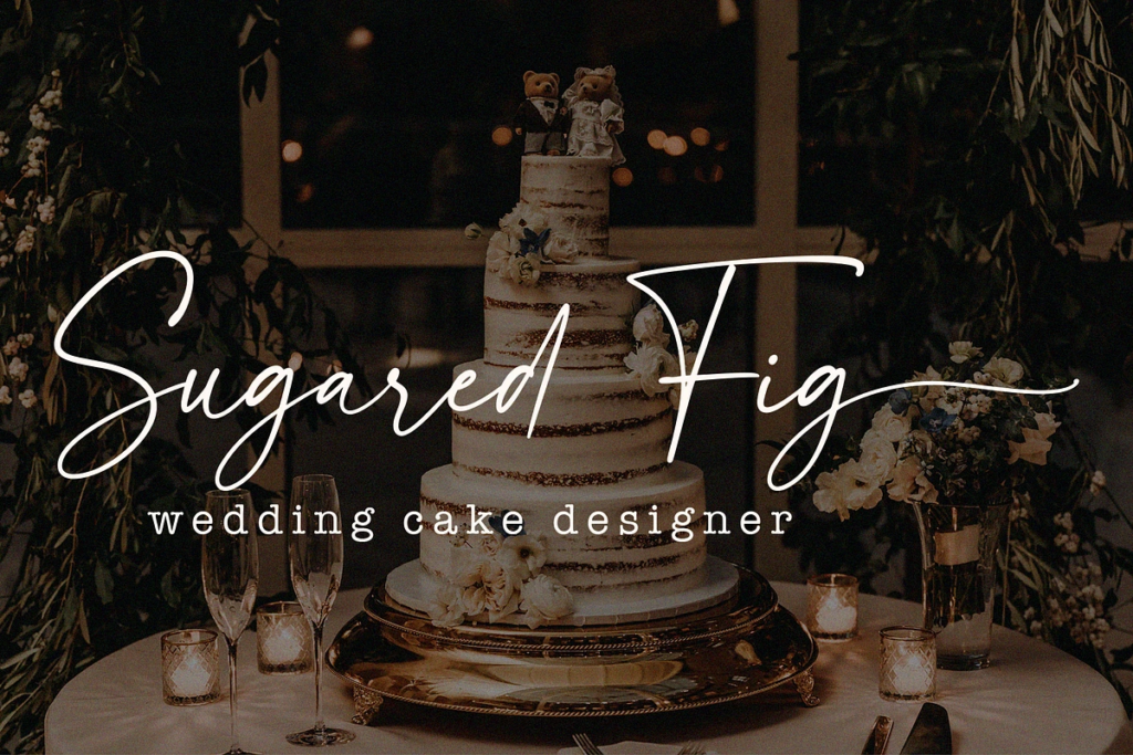
3. Handwritten & Script Fonts, Used With Restraint
Script fonts aren’t new to the photography world, but the way they’re being used in 2026 is evolving.
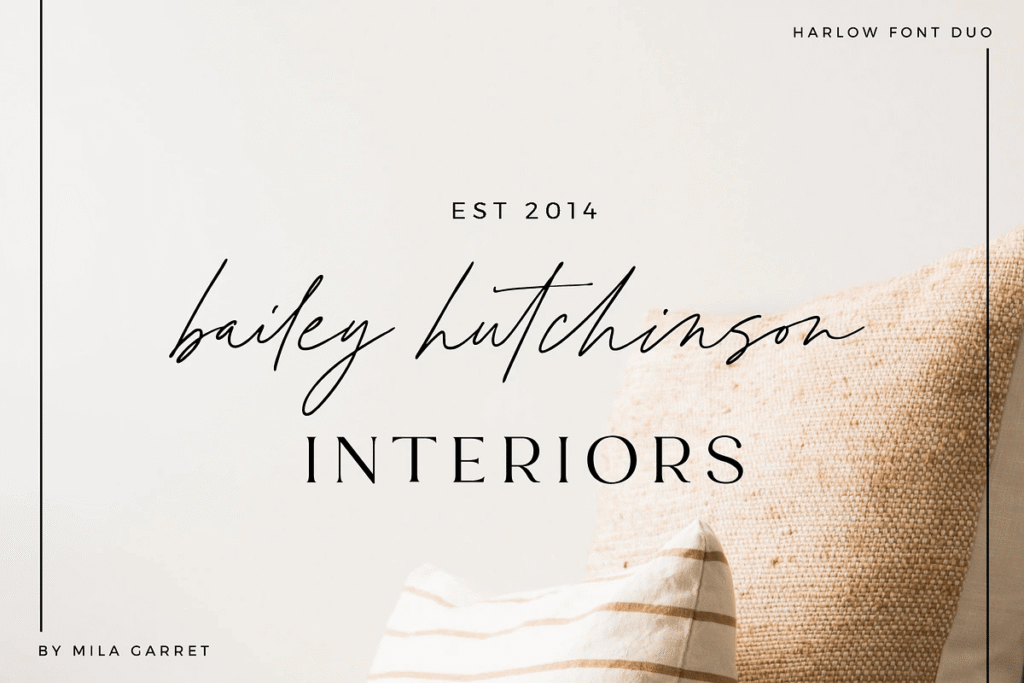
The heavy, overly ornate scripts that dominated wedding brands for years or the overly digitized monolined script (like in the Bailey Hutchinson in the outdated examples above) are giving way to something more refined. Something more middle of the road. Not too overly ornate but more refined than a soul-less monolined script. Think timeless handwriting, fonts that feel personal and human without feeling overdone. Like a letter written by your grandmother, not frilly but still elegant and beautiful.
Used well, a subtle script accent communicates warmth, intimacy, and a personal touch. All things your dream clients are actively looking for in a photographer.
Examples of what to stay away from:

Fonts to explore on Creative Market:
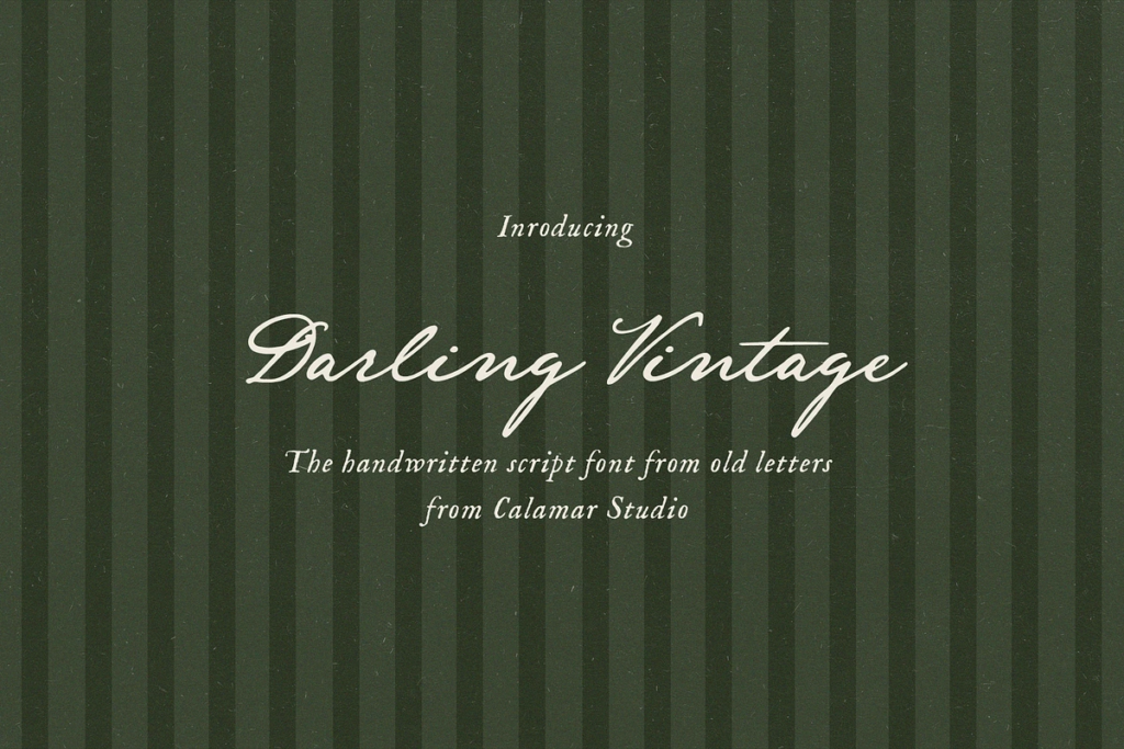
Darling Vintage Handwritten Font by Calamar Studio — Inspired by Jane Austin’s old manuscripts. It is a fairly plain, legible script you might see on a many old letters or other handwritten documents.
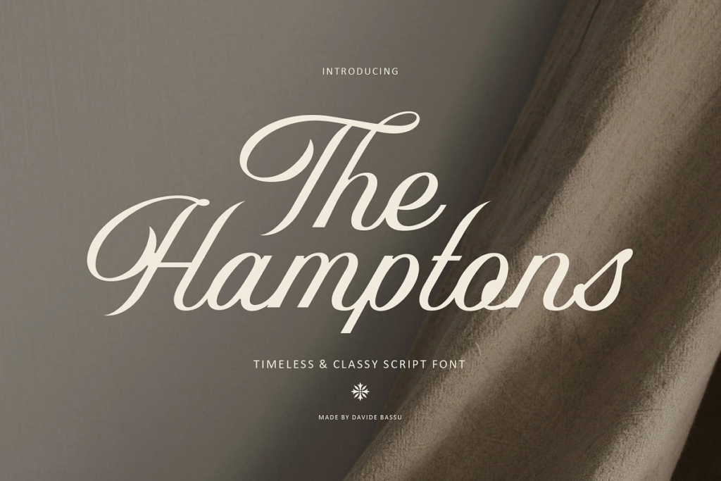
The Hamptons Script Font by David Bassu — this script has a little more contrast to it and feels less handwritten but still feels timeless without feeling too old fashioned.
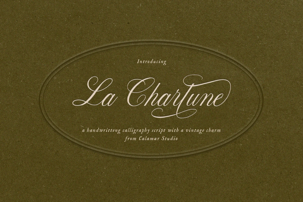
La Charlune by Calamar Studio — This font blends the timeless elegance of classic copperplate script with the warmth of hand-drawn texture.
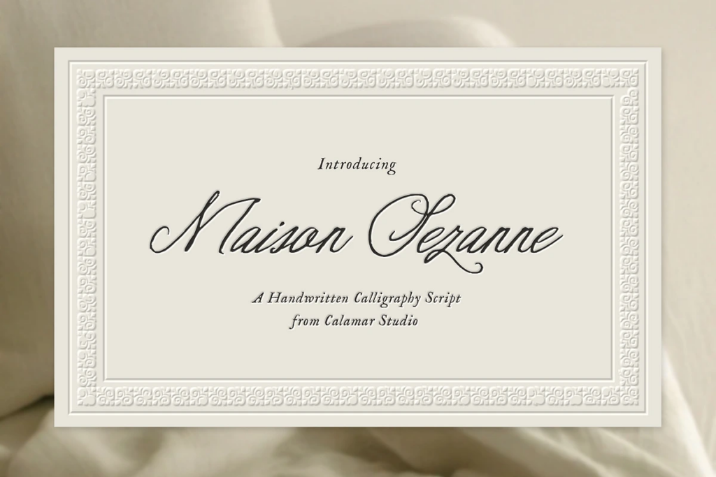
Maison Sezanne by Calamar Studio — This elegant handwritten script font is inspired by refined calligraphy and timeless European aesthetics.
How to use it: Use script fonts sparingly and strategically, as an accent for a single word in a headline, a tagline, or a brand mark. Never use a script font for body copy or long stretches of text. The impact comes from restraint.
4. Clean Minimal Sans-Serifs, The Quiet Confidence Play
Not every wedding photographer needs to go bold and expressive with their typography. For some brands, the most powerful move is to go quieter.
When paired with stunning imagery and generous white space, a clean sans-serif lets your photography do exactly what it should, take center stage. This is what designers are calling “quiet confidence” typography. It doesn’t shout. It doesn’t perform. It simply holds the space with intention, and trusts that the work speaks for itself.
I’ll give examples of sans-serifs that would be beautiful for subheaders and as supporting text and examples of sans-serifs that are still elegant and could be used as your main logo or header font.
Fonts to explore on Creative Market:
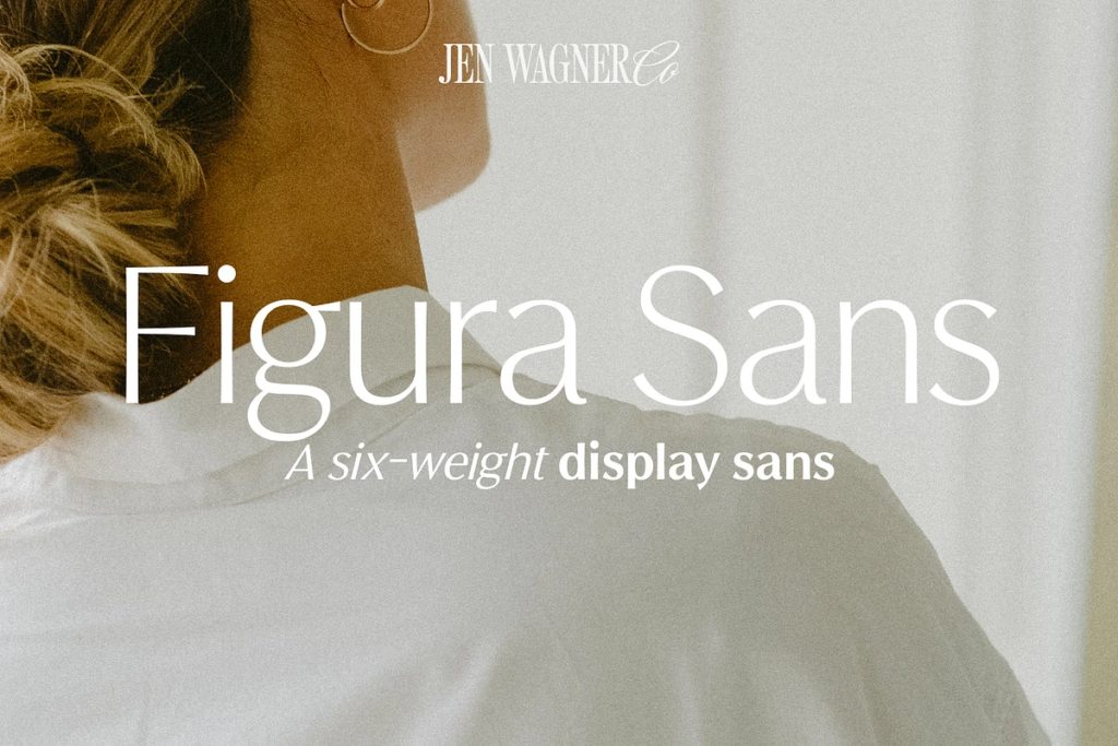
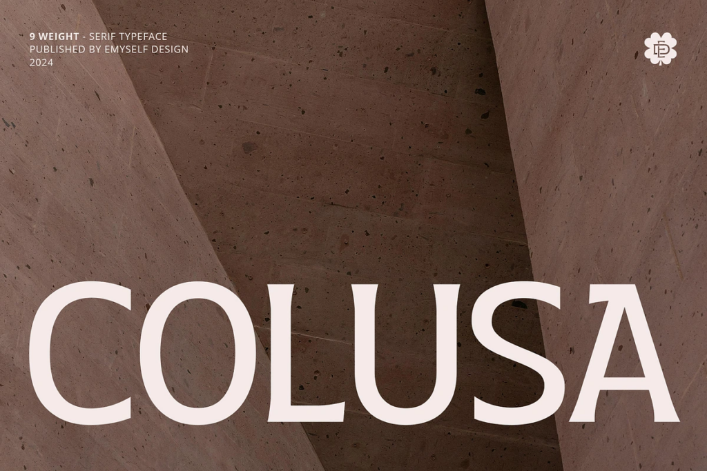
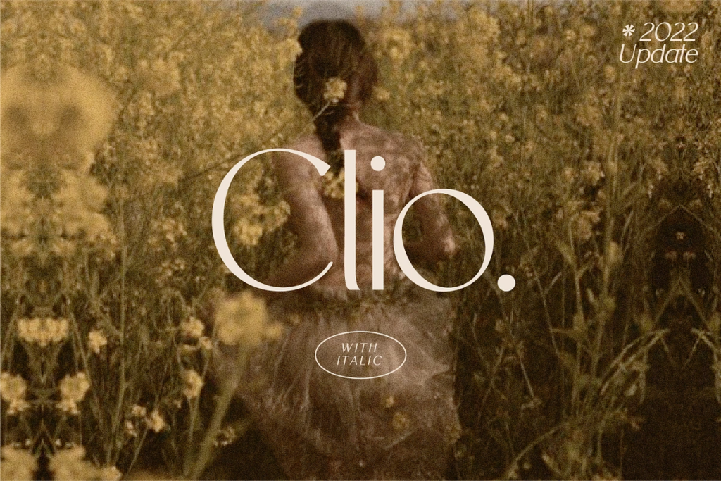
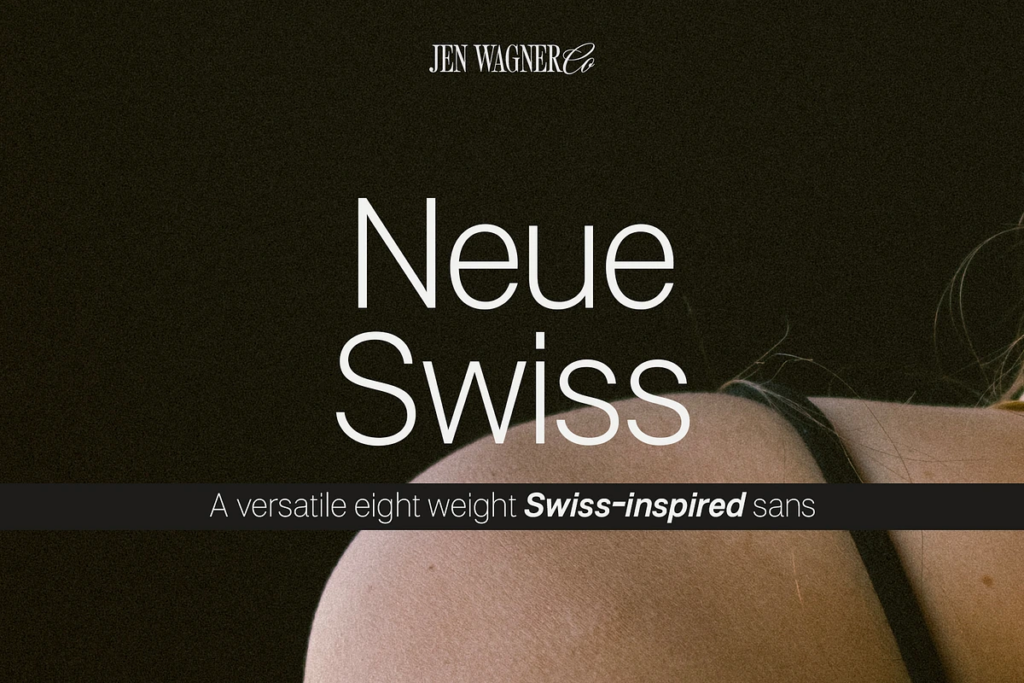
Figura Sans by Jen Wagner — This classic, luxe sans looks incredible in both large and small settings as a display and body text.
Colusa by Emyself Design — Modern serif font that combines minimalist beauty with a touch of classic elegance. Best for headers or logos.
Clio by Harmonais Visual — A display sans serif with simple, clean, and visual elegance. Best for headers or logos.
Neue Swiss by Jen Wagner — Commanding yet minimalistic typeface that effortlessly adapts to any design context. Best used for subheaders or body text.
How to use it: If your photography is bold and editorial, lean into a minimal sans-serif to create contrast and let the images breathe. If your imagery is soft and romantic, opt for a humanist sans-serif with a little more warmth.
5. Editorial Bold Typography, Making a Statement
This one is for the photographers who are ready to be seen.
Bold, expressive display typography is one of the most powerful ways to stop a potential client mid-scroll and make them feel something about your brand immediately. Used well, a single bold font choice in your hero section communicates confidence, clarity, and a distinct point of view. All things that luxury clients are actively drawn to.
For fine-art photographers, this trend works especially well when the bold typography is balanced by soft, romantic imagery. The contrast creates a tension that feels sophisticated and intentional. Elevated, not overwhelming.
Fonts to explore on Creative Market:
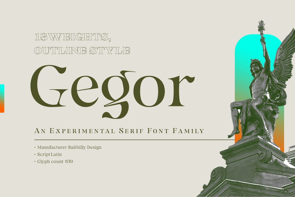
Gegor by Bilibilly Design — Display serif with interesting contrast and points that still feels sophisticated but most definitely not boring.
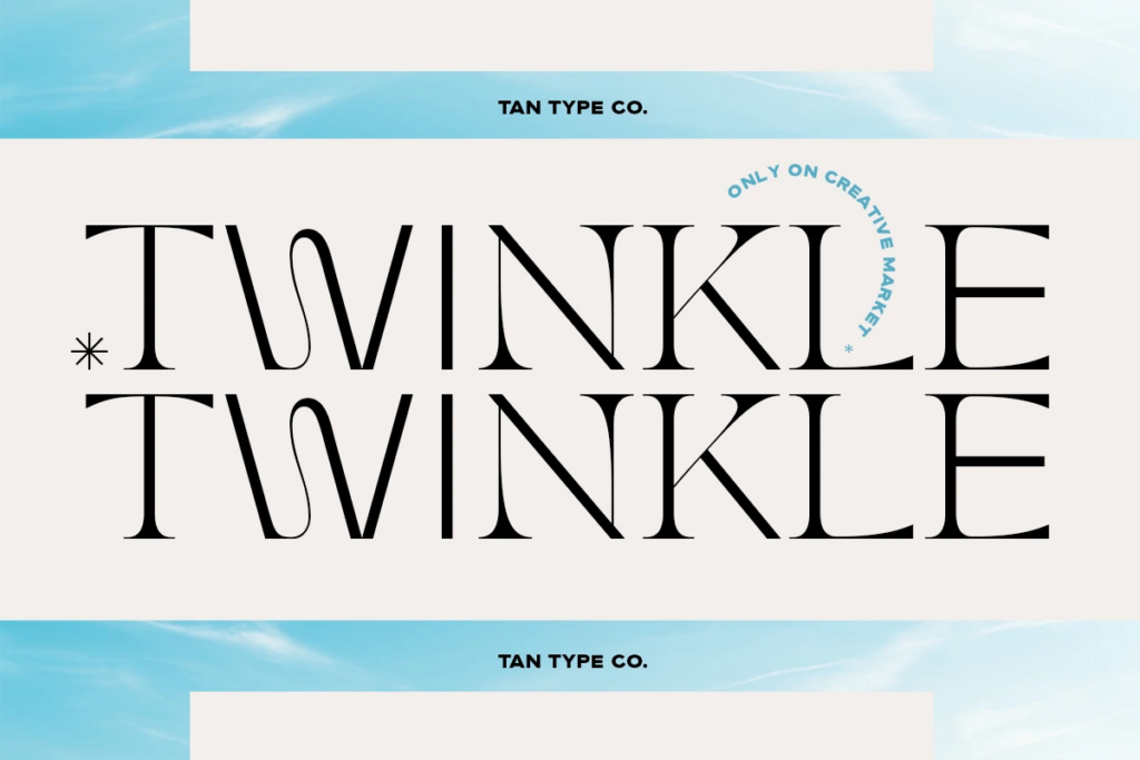
Twinkle by Tan Type Co. — A hybrid between serif and sans serif, creating a modern, delicate and contemporary look.
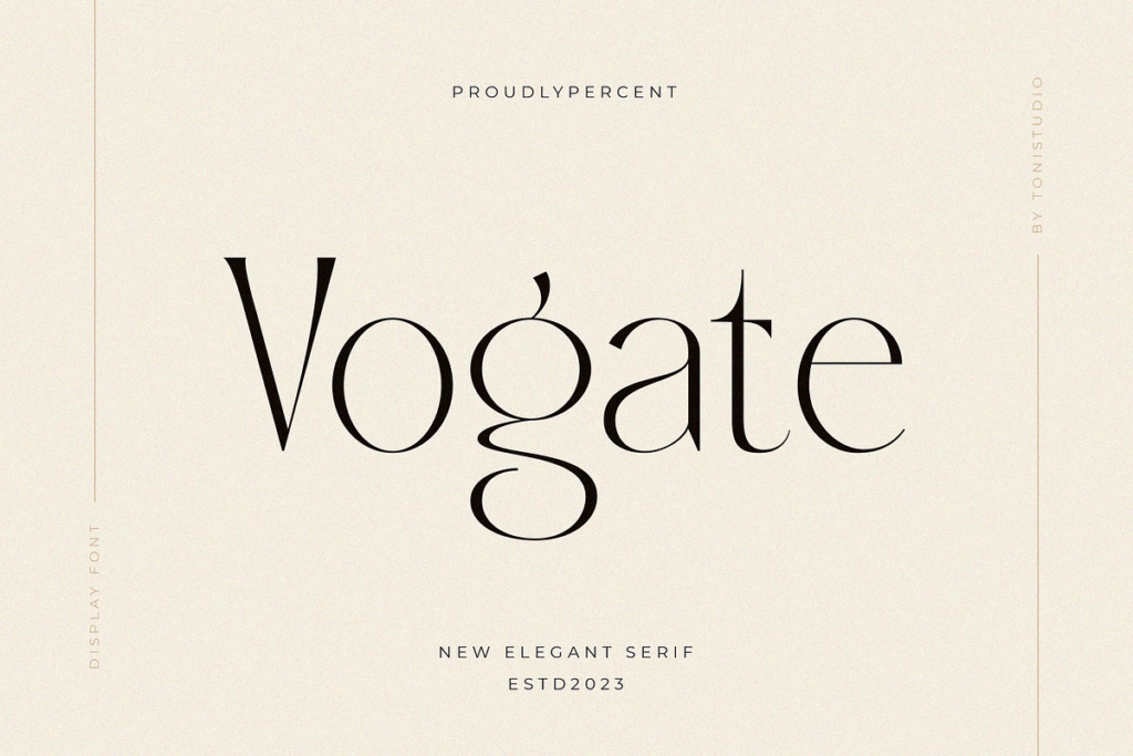
Vogate by ToniStudio — Combines contemporary sophistication with timeless elegance, perfect for bringing a sense of luxury and refinement.
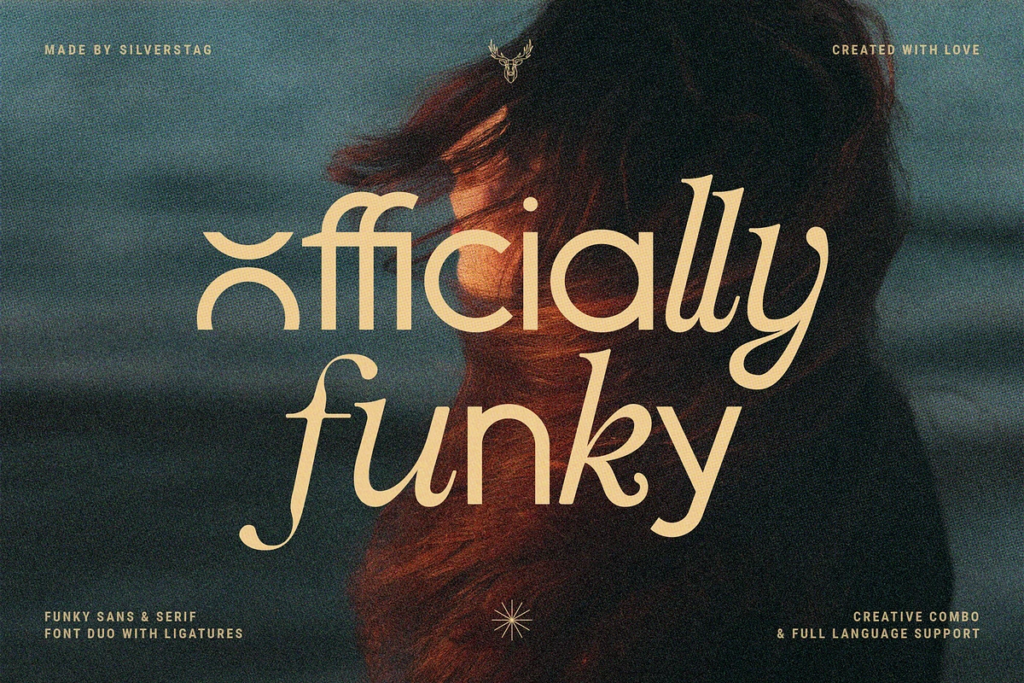
Officially Funky by Silverstag — A font that is both modern and nostalgic, serif and sans serif. I think this font feels very elevated and combining the italic serif with the sans serif feels so cool and sleek.
How to use it: Reserve bold display typography for your logo and/or hero headline or a single statement section on your homepage. Pair it with a lightweight simple body font and plenty of white space so it has room to breathe and land with impact.
Fonts for Photographers Are a Brand Decision
Here’s what I want you to take away from all of this.
Typography isn’t decoration. It’s not something to choose at the end of a rebrand when everything else is already decided. The fonts for photographers that are resonating right now are the ones that were chosen intentionally, with a clear understanding of who the brand is trying to attract and what feeling it’s trying to create.
Your fonts are part of your positioning. They’re part of how a dream client decides in seconds whether you’re the right fit for them.
And when they’re working, you’ll feel it… In the inquiries that come in already sold. In the clients who say “I just knew you were the one” before they ever got on a call with you.
That’s what strategic branding does. And it starts with the details including the fonts.
Ready to Build a Brand That Does the Talking For You?
If reading this made you look at your own brand and website fonts and think “hmm…” That feeling is worth paying attention to.
My signature Booked and Branded offering is a 3-Day intensive where I’ll bring your branding and website to life wedding planners. This includes designer-chosen, strategic typography system — headers, subheaders, body copy, CTAs, and everything in between — designed to position you as the premium choice in your market.
Because the right fonts aren’t just pretty. They’re doing a job. Let’s make sure yours are doing it well.


Inside this guide I will give you actionable, step-by-step tips that you can implement in your website right away to lay a strong SEO foundation and start seeing better SEO results so you can get organic leads to your site so qualified potential leads can easily find you on Google.
easy SEO Guide To help you have a good seo foundation to Get Your Site Found on Google
free download


