Meant 2 Bee Events Custom Website & Copywriting
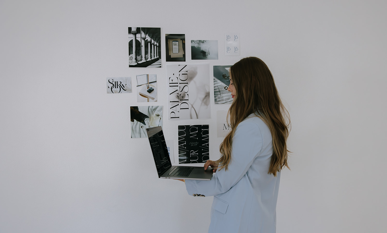
When Marissa, the owner and lead planner behind Meant 2 Bee Events, reached out about elevating her online presence and working together on her wedding planner website design, she already had something special. Her business had grown through heartfelt referrals, her reputation was strong in her market, and her planning experience was known for being fun, supportive, and beautifully organized. But she wanted her online brand to truly match the level of service she provides and the experience her couples feel when they work with her.
This project became one of my favorite examples of what a strategic and story-driven wedding planner website design can do. It gave her the polished, professional, personality-filled online home her business deserved while also creating a warm, modern space for future couples to fall in love with her approach.
Below is a behind-the-scenes look at the goals, strategy, and transformation that shaped this website project.
Understanding Her Audience and Creating a Wedding Planner Website Design With Intent
Before any design choices were made, we spent time defining the heart of her audience. Meant 2 Bee Events works with engaged couples, most often women, in their mid 20s to late 30s. Their budgets typically begin around sixty thousand dollars and they want a planning partnership that feels thoughtful and supportive, not transactional or surface level.
These couples want more than someone who can manage timelines and vendor calls. They want a guide, a voice of calm, and someone who sees them as real people with real stories. They want to feel cared for while also feeling confident in the expertise behind the scenes.
Every page of her wedding planner website design was created to honor that mindset. It blends warmth with experience, beauty with clarity, and professionalism with personality. The goal was to help her ideal clients feel seen the moment they land on her homepage.
A Process Rooted in Connection and Trust
One of the things that immediately stood out about Marissa was her commitment to connection. While many planners lean heavily on logistics alone, she approaches planning with a deeper lens. She learns her couples’ stories, understands what matters to them most, and uses intentionality to ensure every detail has purpose.
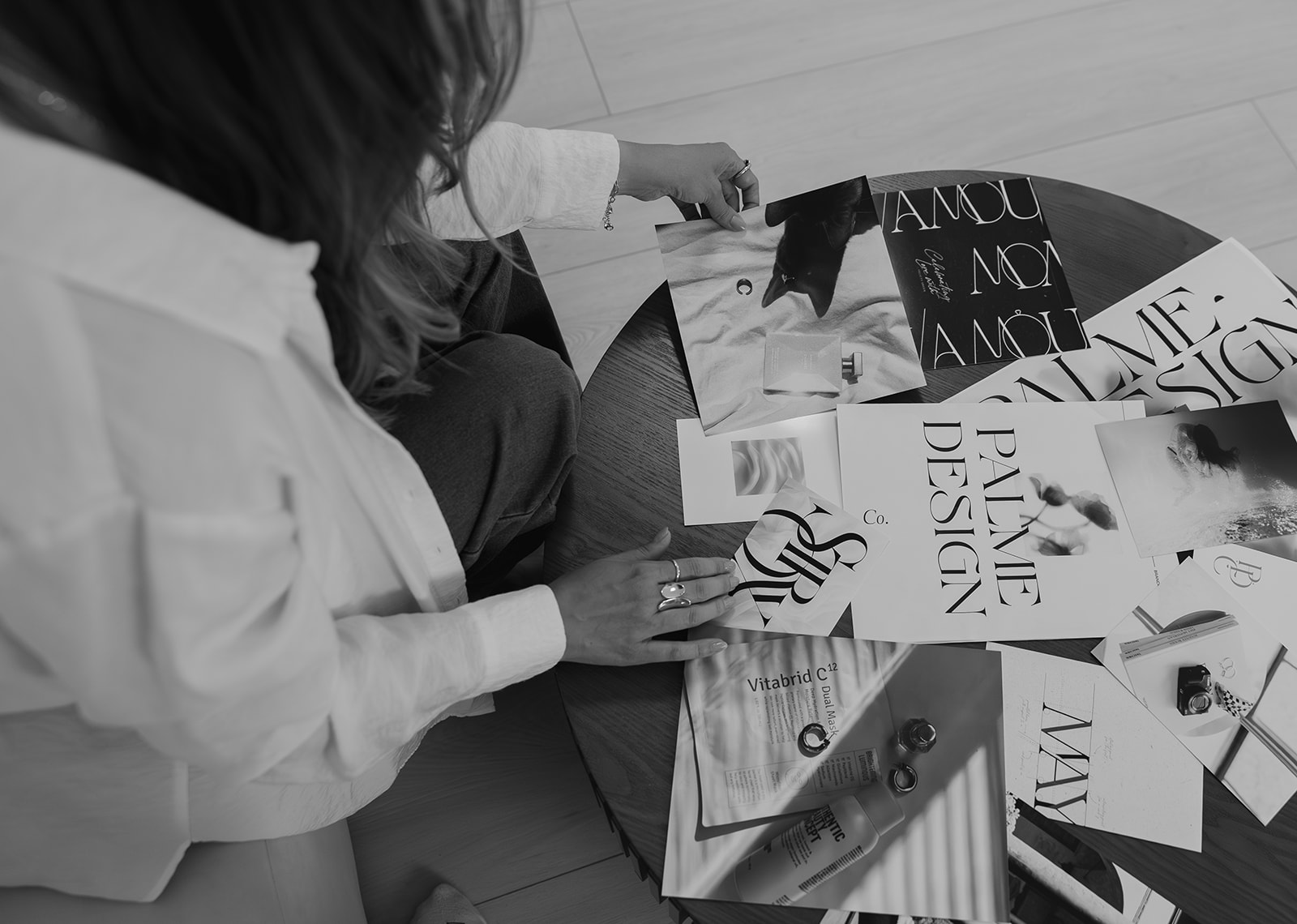
This became a central theme in her wedding planner website design. Her copywriter did an incredible job capturing this essence in her messaging, and my role was to translate that heart into visuals and user experience.
We created a brand presence that highlights her reputation, her warmth, and her ability to deliver a high-touch boutique experience. Her clients are choosing someone who will become their advocate and sounding board throughout the entire planning journey, so the website needed to reflect that level of care.
Design Goals for the Wedding Planner Website Design
From the very beginning of the project, we outlined several goals that would shape the direction of the design.
1. Showcase her elevated, fun, and friendly brand personality
Her brand is warm and current. It’s professional without feeling stiff, and it is emotional without being overly sentimental. This balance guided the typography, color palette, and layout choices. Every design decision was meant to feel like her personality translated into digital form.
2. Reflect a high-end client experience with thoughtful touches
Her couples invest in a planner who can take the weight off their shoulders. The website needed to echo that sense of clarity and ease. Clean navigation, intuitive paths, intentional white space, and curated imagery helped create a digital environment that feels as refreshing and organized as her planning process.
3. Build trust from the moment visitors arrive
Trust is the core of her business model. To support this, we used social proof, real client stories, and strategic design placements that help new visitors see her experience and reputation right away. The design also emphasizes her role as an expert guide, someone who stands beside her couples at every stage.
4. Make the entire user experience feel friendly and enjoyable
Many wedding planner websites overwhelm visitors by packing in too much information or focusing only on logistics. Our approach was to make the process feel simple, joyful, and welcoming. The tone of her brand shines on every page, thanks to the collaboration between design and copywriting.
A Wedding Planner Website Design With Personality and Intentionality
The final website blends structure and soul. Here are a few of the highlights that define the finished experience.
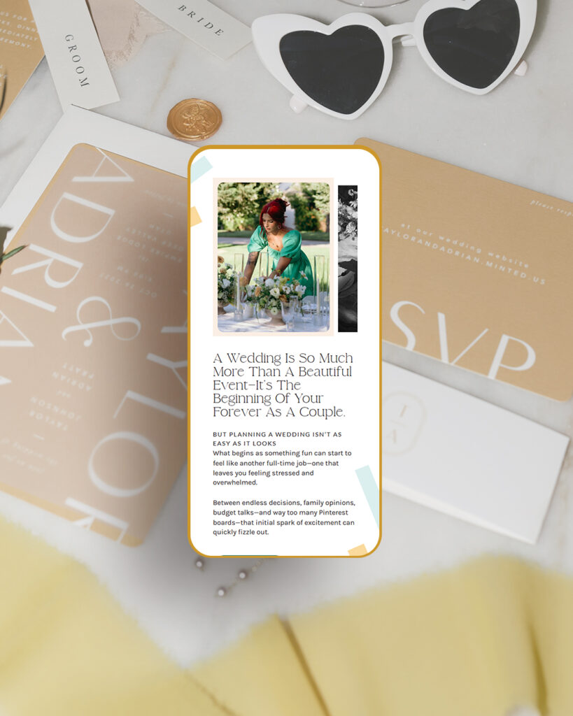
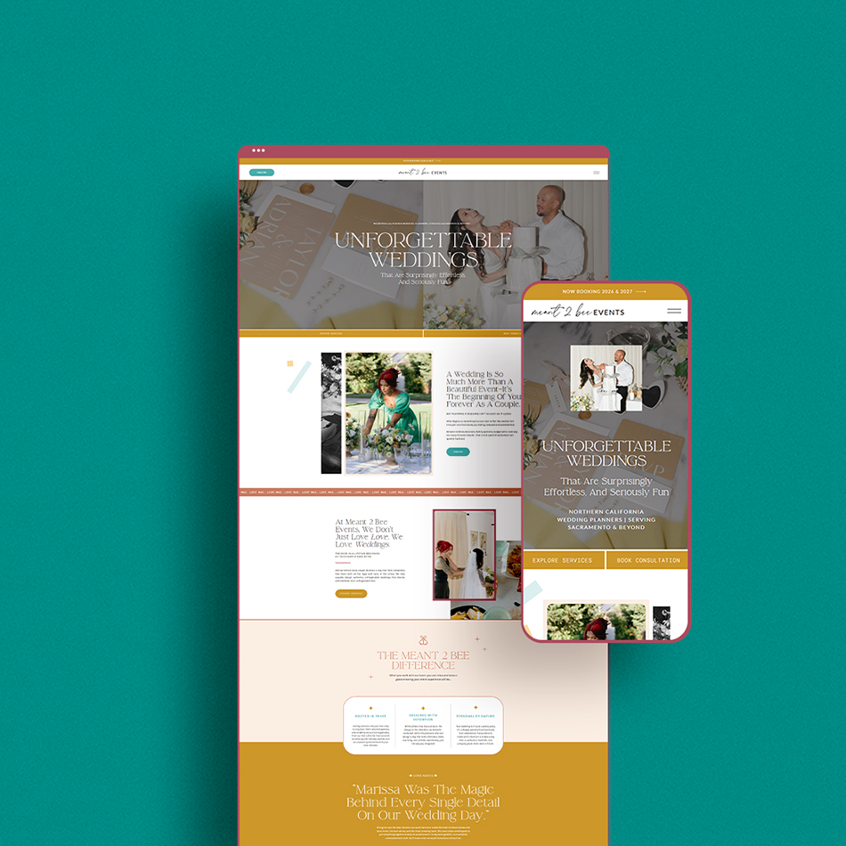
A Homepage With Heart
The homepage serves as a warm welcome. It’s inviting, easy to navigate, and visually curated to reflect her thoughtful approach to planning. Visitors are instantly met with friendly messaging, refined visuals, and clear calls to action. The design subtly leads them deeper into her world while keeping the experience easy and enjoyable.
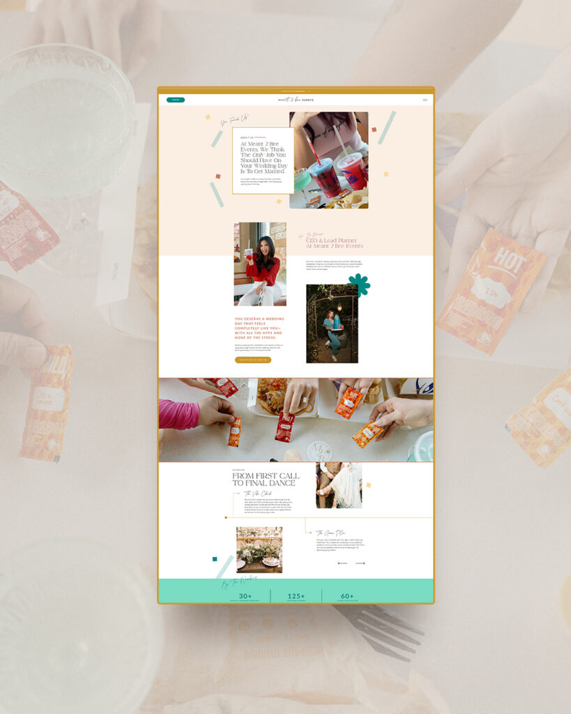
Service Pages That Build Confidence and Clarity
Her service pages were designed to answer questions before her couples even think to ask them. Instead of overwhelming visitors, the layout introduces information in a digestible way. It showcases what makes her process different and explains how she takes the stress off her clients without sacrificing creativity or detail.
These pages help potential clients understand exactly what it feels like to work with her. They also communicate her high level of experience and her boutique service model.
A Portfolio That Feels Like a Celebration
Her portfolio page focuses on real celebrations and real moments. The design allows the images and stories to shine without unnecessary clutter. The purpose was to create a gallery that feels joyful and inviting. Couples browsing her portfolio can quickly picture themselves in her care.
A Contact Page That Encourages Connection
Instead of feeling like a basic form, her contact page was intentionally designed to feel like an open door. It guides visitors with warm copy and an easy-to-follow layout. The underlying purpose is to help couples feel confident and excited as they take the next step in the process.
How Her Brand Feelings Guided the Creative Choices for Meant 2 Bee’s Wedding Planner Website Design
Marissa wanted her brand to feel fun, current, professional, warm, experienced, and unique. We made these qualities the foundation of every creative decision.
Fun and current
To convey a modern and upbeat energy, we incorporated playful but polished design elements. Fresh typography choices, subtle movement, and a crisp layout keep the experience feeling lively without being overwhelming.
Professional and experienced
Her long-standing reputation needed to shine through visually. We incorporated organized structure, thoughtfully placed trust points, and a clean hierarchy that communicates expertise.
Warm and unique
From color palette to image curation to microcopy, the tone remains relational and inviting. This helps differentiate her from planners who present a more corporate or strictly logistical front.
The result is a brand experience that feels distinctly hers. Anyone visiting her site can instantly sense the heart behind her work.
Why This Wedding Planner Website Design Works So Well
This project stands out not just because it is beautiful, but because it is rooted in strategy. It works because it speaks directly to the emotional and practical needs of her ideal clients. Here are a few reasons it is so effective.
1. Meets her ideal clients where they are
Her audience wants a planner who is warm, knowledgeable, and fully invested in their experience. The design shows them exactly that.
2. Highlights what makes her truly different
Many wedding planners claim to offer personalized service, but Marissa lives it. She only takes on a limited number of weddings each year so she can be fully present for each couple. The website clearly communicates this boutique service model in a refreshing and authentic way.
3. Balances emotion and expertise
Couples feel a connection to her story and personality, while also seeing the professionalism and structure behind her process. This balance is key to converting high-quality inquiries.
4. Removes overwhelm
The site is clean, organized, and easy to navigate, which mirrors the way she guides her couples through planning.
5. Strengthens her brand with consistency
Every page aligns with her tone, voice, aesthetic, and values. That consistency builds trust and positions her as a top-tier planner.
Looking Ahead
Creating this wedding planner website design with Marissa was such an enjoyable and collaborative experience. She brought a clear vision, a meaningful brand foundation, and beautifully written copy that set the tone for the design. Together, we built a wedding planner website design that not only represents her brand well, but sets her up for continued growth with the right clients.
The new Meant 2 Bee Events website is warm, polished, and full of heart. It feels like stepping into the beginning of a couple’s story, guided by someone who cares deeply about their experience. It showcases her expertise and energy in a way that feels inviting, organized, and completely aligned with the way she serves her clients.
If you are a planner, creative, or service provider who feels like your current website does not match the quality of the work you provide, you deserve a digital home that elevates your brand too. A strategic, story-driven design can transform the way your ideal clients see you and help you connect with the people you are meant to serve.
From Marissa
”Working with Kara and Palme Design Co was such a great experience! From start to finish, they took the time to understand my vision and turned it into a website that feels both beautiful and functional. Their creativity, professionalism, and attention to detail really stood out. They were always responsive, patient with my questions (and I had a lot lol), and went above and beyond to make sure everything was just right. I couldn’t be happier with the end result—it truly reflects my brand and makes a strong impression on visitors. I would highly recommend Kara and Palme Design Co to anyone looking for a design team that combines skill, style, and genuine care for their clients. I’m OBSESSED with my new site!
View Marissa’s video testimonial:
The Vibe
- Fun
- Current
- Professional
- Experienced
- Warm
- Unique
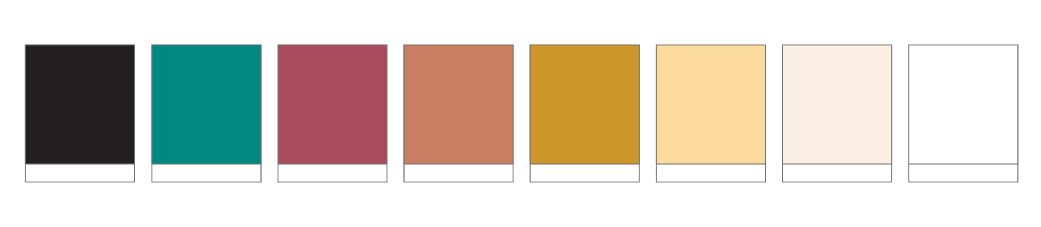
The Color Palette
The Website