


There is a particular kind of frustration that comes with knowing exactly what you want for your photography branding, and not being able to get there on your own.
Lindsay Monahan knew it well.
A Delaware and Maryland wedding photographer with a portfolio full of timeless, film-inspired imagery and a client experience rooted in happiness, lightness, and genuine connection. Lindsay had the talent. She had the vision. And even had a Showit website she had worked hard to build out on her own.
What she was missing was the one thing that ties it all together: A brand identity that actually looked like her.
The Starting Point
When Lindsay came to us, she said something that I hear time and time again: “I feel like I know what I want but have never been able to achieve it on my own.”
That’s one of the most common things I hear from photographers who are ready to invest in professional photography branding, and it makes complete sense. Knowing what you want and being able to translate it into a cohesive visual identity are two completely different skills.
Lindsay had moved to Showit the previous winter and gotten her website as polished as she could on her own. But something was still missing. The overall brand identity (the logos, the colors, the typography system that would tie everything together) wasn’t there yet.
She knew the feeling she wanted to create. Coastal. Elevated. Romantic. Simple. The kind of brand that felt like hydrangeas meeting the beach, and what she lovingly described as “coastal grandma” energy, in the best possible way. Immediately obsessed.
She just needed someone to help her get it out of her head and onto the page.
If you’re in a similar place, my post on How to Create a Mood Board for Your Photography Brand walks you through the exact process we take every client through before a single design element is touched.
The Vision
Lindsay’s ideal clients are engaged couples planning their wedding, couples who are drawn to romantic, dreamy tones and a photography experience rooted in warmth and authentic connection.
What sets Lindsay apart from her competitors is her unique film-inspired editing style, a blend of light and airy with true-to-life colors that most photographers choose one or the other of, not both. Her brand is rooted in happiness, lightness, and connection, and that shows up in everything from her images to the way she shows up for her clients.
Her photography branding needed to reflect all of that. Elevated enough to justify raising her prices, distinctive enough to stand out in a crowded market, and coastal enough to speak directly to the beach wedding couples she loves most.
Here’s what she brought to the table:
The feeling: Timeless. Romantic. Natural. Feminine. Sophisticated. Coastal.
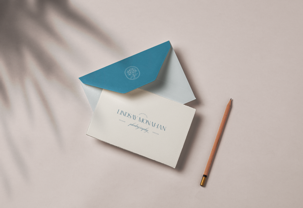
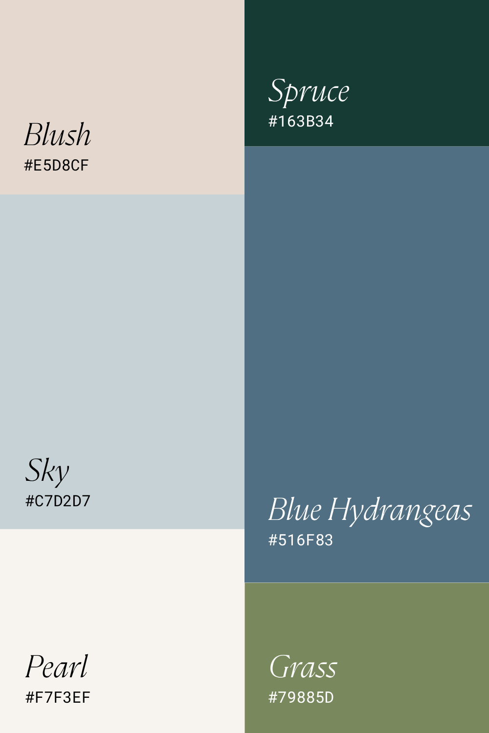
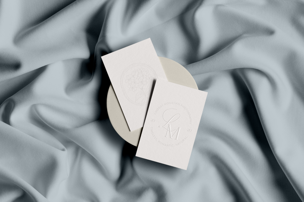
The colors: Dusty blue as her primary, with soft sand pink and a deeper pink as secondary tones — a palette that feels like a perfect Delaware beach day.
The typography: Lindsay was refreshingly clear about what she didn’t want. No intense cursive. No overly fancy scripts that every other photographer seems to use. She gravitated toward something clean and readable (i.e. easy on the eye, with just a touch of softness to feel feminine without being fussy).
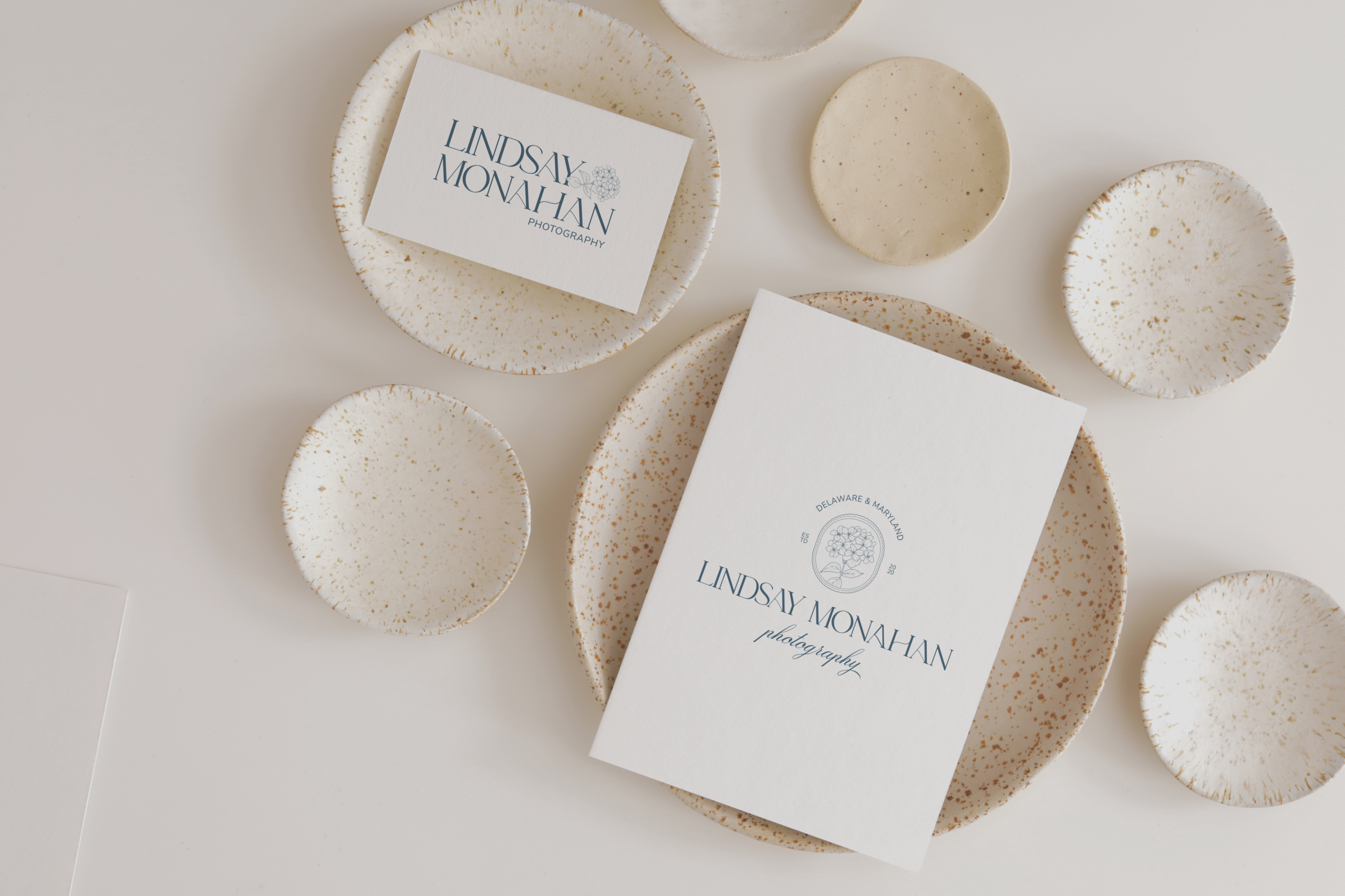
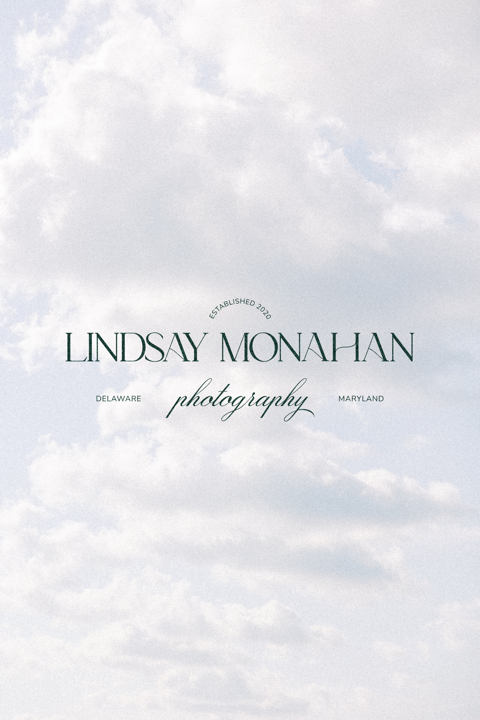
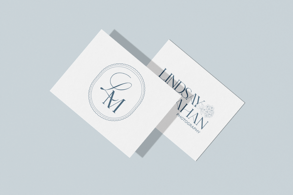
The logo: Rather than a simple initial mark, Lindsay wanted her full name written out with the possibility of hydrangeas incorporated somewhere in the suite, a subtle nod to the coastal florals that feel so aligned with her aesthetic.
The Result
What we built for Lindsay is a photography branding suite that does exactly what great branding should do, it makes her dream clients feel something the moment they encounter it.
Her new brand identity captures the timeless, coastal, film-inspired world she photographs so beautifully. It’s feminine without being overdone. Sophisticated without being cold. And most importantly, it finally looks like the photographer she actually is.
The dusty blue, soft pink, and sand color palette evokes exactly the kind of dreamy beach wedding energy that Lindsay’s ideal couples are searching for. The typography is clean, readable, and quietly elevated, a refreshing departure from the overly ornate scripts saturating the wedding photography market right now.
And the logo suite? It tells Lindsay’s story in the most beautiful way (her name, her aesthetic, her coastal identity) all in one cohesive visual system she can use across her website, her social media, her client materials, and everything in between.
Here’s what Lindsay had to say about the experience:
“Palme Design Co created exactly what I wanted. They listened and asked questions to ensure they understood my vision. The whole process was streamlined and straightforward. The second Kara and I had our first connection call, I knew I picked the right design team for my logo. I stared at my final designs for so long because I was just so in love!”
View how Lindsay’s website looks with her new branding
What Strong Photography Branding Actually Does
Lindsay came to us wanting two things… to offer more value and to raise her prices. And here’s the truth about both of those goals: they’re not really about the numbers. They’re about confidence and positioning.
When your photography branding finally reflects the caliber of your work, something shifts. You show up differently, send your website link without hesitating, and quote your prices without apologizing. And the clients who find you? They arrive already knowing you’re exactly who they’ve been looking for.
That’s what a brand that actually looks like you does. It does the selling before you ever get on a call.
Not sure if your current brand is holding you back? We broke down the 5 Signs It’s Time to Rebrand Your Photography Business. Read through and see how many resonate.
Is Your Photography Branding Holding You Back?
If you’re a wedding photographer who has been DIY-ing your brand (getting it as good as you can on your own) and something still feels off, you’re probably right. And you don’t have to stay there.
We work with wedding photographers, planners, and florists who are ready to stop blending in and start attracting the clients they’re truly meant to serve. If that’s you, I’d love to chat.
You Might Also Love
5 Signs Your Photographer Branding Is Holding You Back
How to Create a Mood Board for Your Photography Brand
Fonts for Photographers: 5 Typography Trends Fine-Art Photographers Need to Know in 2026
Whitney Marshall Photo: Wedding Photographer Logo & Brand Refresh
The Vibe
- Grandma Chic
- Coatal
- Feminine
- Sophisticated
- Simplistic
The Color Palette
The Logos


Inside this guide I will give you actionable, step-by-step tips that you can implement in your website right away to lay a strong SEO foundation and start seeing better SEO results so you can get organic leads to your site so qualified potential leads can easily find you on Google.
easy SEO Guide To help you have a good seo foundation to Get Your Site Found on Google
free download


