


Let’s talk high end branding. You’ve put in the work… Your portfolio is strong. Your client experience is polished. Your editing style is distinctive and refined.
But something still feels off.
Maybe the inquiries aren’t quite matching the caliber of work you deliver. Or you hesitate before sending your website link. You look at other photographers in your market and wonder why their brand feels so much more elevated than yours, even though your work is just as good.
More often than not, the answer lives in your branding (i.e. your logos, color palette, and fonts).
High end branding isn’t just about looking pretty. It’s about creating a visual identity that communicates your value, attracts your dream clients, and positions you as the premium choice in your market before anyone ever reaches out.
And for wedding photographers who want to attract elevated, luxury clients, these are the seven most common branding mistakes standing in the way.
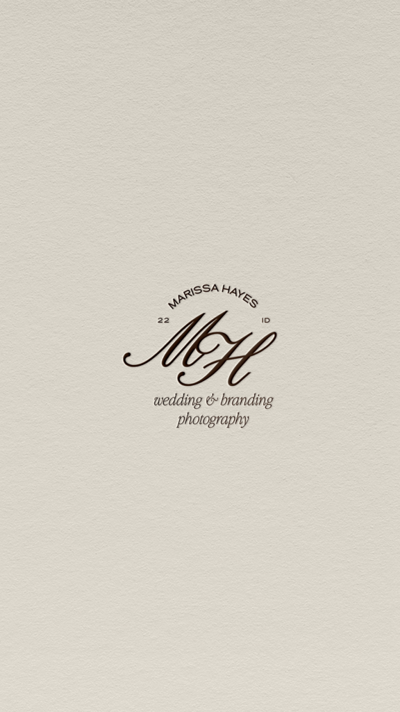
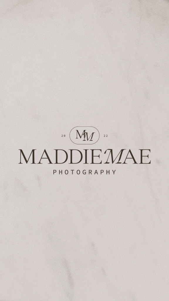
Mistake #1 Using Graphics in Your Logo When a Wordmark Would Serve You Better
Graphics in logos can work, but for wedding photographers who want to attract high end clients, a wordmark is almost always the safer (and stronger) bet.
Here’s why… A wordmark (a logo that leads with your name in a carefully chosen, beautifully designed typeface) is cleaner, more versatile, and translates better across every single touchpoint your brand lives on. Your website header, watermark, business card, email signature, and Instagram profile picture.
Graphics add complexity. And complexity, especially at small sizes, starts to look cluttered and amateur rather than elevated and refined. When’s the last time you’ve seen a floral graphic in a fellow photographer’s logo? Probably 5 minutes ago. And on top of being overdone, it’s starting to look dated. Yikes!
That’s not to say a graphic element can never work. A subtle brand mark (a delicate floral detail, a simple monogram, a refined icon) used as a secondary element in a thoughtfully designed logo suite can be incredibly beautiful. But your primary logo should lead with your name and let the typography do the work.
The most elevated wedding photographer brands in the market right now are almost always built on a beautifully crafted wordmark. There’s a reason for that.
Check out this post all about typography trends for photographers with fonts selected from Creative Market that I love!
Mistake #2 Choosing a Visual Identity Based on What You Like
This one is uncomfortable to hear… but it’s one of the most important shifts you can make as a photographer who wants to attract high end clients.
I’ll hold your hand while I say this. Your brand is not for you, it’s for your dream client.
Pink might be your favorite color. Script fonts might be what you’re personally drawn to. Bright, bold, maximalist design might feel exciting and fun to you. But if your dream clients are drawn to soft, editorial, timeless aesthetics, your brand needs to speak their language, not yours.
Before making any visual decisions like colors, fonts, logo style, imagery, ask yourself one question: when my dream client lands on my website, does this make them feel immediately seen and understood? Does it feel like it was made for them?
That’s the standard your brand needs to meet. Not whether you personally love the color palette. Not whether your best friend thinks the logo is cute. Whether your dream client feels, in the first three seconds, that you are exactly who they’ve been looking for.
Your preferences can inform your brand. But your dream client’s taste should guide it.
Mistake #3 Starting Your Logo From a Canva Template
Okay, now I’m really stepping up on my soapbox for this one. If you want to stand out, be memorable, and attract clients who are willing to invest in premium photography, you cannot start your logo from a template that hundreds of other photographers have already used.
Look, if you’re just barely starting out and not yet generating revenue for your business, then sure. Go with a template until the soonest moment you can invest in your branding. But honestly, even then I think you’d be better off finding a font you love on Creative Market for $20-$30 that you can upload to Canva (does require Canva Pro) and type out your brand name with it than using a generic template.
Canva templates are designed to be used by anyone, in any industry, for any purpose. They are the opposite of distinctive. And distinctiveness is the entire point of high end branding.
When a potential client is researching wedding photographers… opening tab after tab, comparing galleries, reading about pages, the brands that stop them in their tracks are the ones that feel completely unique. Like nobody else. Like they were built from scratch for exactly this photographer and exactly this audience.
A Canva template cannot do that. By definition, it starts from a place of sameness.
If budget is a concern, a semi-custom branding package from a professional designer is a far better investment than a Canva logo. You’ll get something that actually feels like you — strategic, intentional, and built to attract the clients you want, without the full price tag of a completely custom identity.
Your logo is the foundation of your entire brand. Don’t compromise on it.
Mistake #4 No Clear Visual Consistency Across Platforms
Your Instagram grid has one color palette. Your website has another. Your client welcome guide uses completely different fonts. Your email signature looks like it belongs to a different business entirely. You’re at the whims of whatever you’re feeling the day you sit down to create this elements for your business and it’s costing you brand recognition (AKA trust… AKA bookings).
This is one of the quietest (and most damaging) high end branding mistakes wedding photographers make. And most don’t even realize they’re doing it.
Here’s the thing about high end clients: they notice inconsistency even when they can’t name it. It creates a subtle sense of unease, a feeling that something is slightly off, that makes them less likely to trust you with one of the most important days of their lives.
Consistency, on the other hand, builds trust. When every single touchpoint (your website, your social media, your client materials, your email signature, your watermark) feels like it belongs to the same cohesive world, it signals professionalism, intentionality, and attention to detail.
Those are exactly the qualities luxury clients are looking for in a photographer.
The fix starts with a clear brand identity (i.e. defined colors, defined fonts, defined logo usage guidelines) and the discipline to apply them consistently everywhere your brand shows up.
Mistake #5 Copying Trends Instead of Building a Timeless Brand
Every year there’s a new wave of design trends sweeping through the photography industry. A particular font everyone suddenly starts using. A color palette that shows up on every photographer’s website. A logo style that feels fresh for about six months and then starts to feel dated.
Chasing trends gives your brand an expiration date.
The wedding photographers with the most elevated, recognizable brands aren’t the ones who followed what was popular. They’re the ones who built something timeless, a visual identity rooted in their own aesthetic sensibility and their dream client’s taste rather than whatever was trending on Pinterest that year.
Timeless doesn’t mean boring. It means intentional. It means choosing fonts, colors, and design elements that feel elevated and refined regardless of what’s popular right now because in two years, what’s popular right now will feel very, very 2026.
Ask yourself: will this brand still feel relevant and elevated in five years? If the answer is yes, you’re on the right track.
Mistake #6 Copying Another Photographer’s Brand
We’ve all been there. You stumble across a photographer’s brand and think that is exactly what I want. That’s the vibe. That’s the feeling.
And it’s completely natural to feel inspired by what others are doing well. But there’s a critical difference between drawing inspiration and recreating someone else’s visual identity, and it’s a difference that will cost you.
Their high end branding might be absolutely fire. But it was built for their audience, their aesthetic, their positioning in their market. What works beautifully for them may not resonate with your dream clients at all.
More importantly, you don’t want to blend in. You want to stand out. You want to be the photographer a couple remembers when they close their laptop after researching twelve different options. You want to be distinctive, memorable, and completely recognizable as yourself.
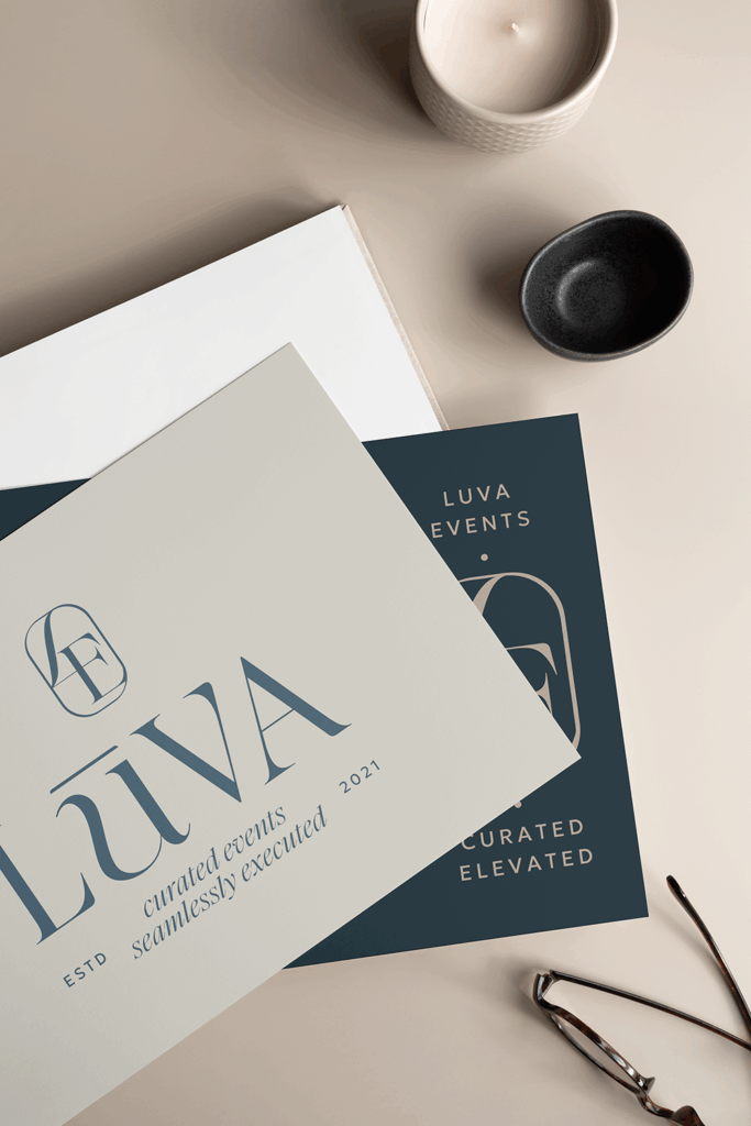
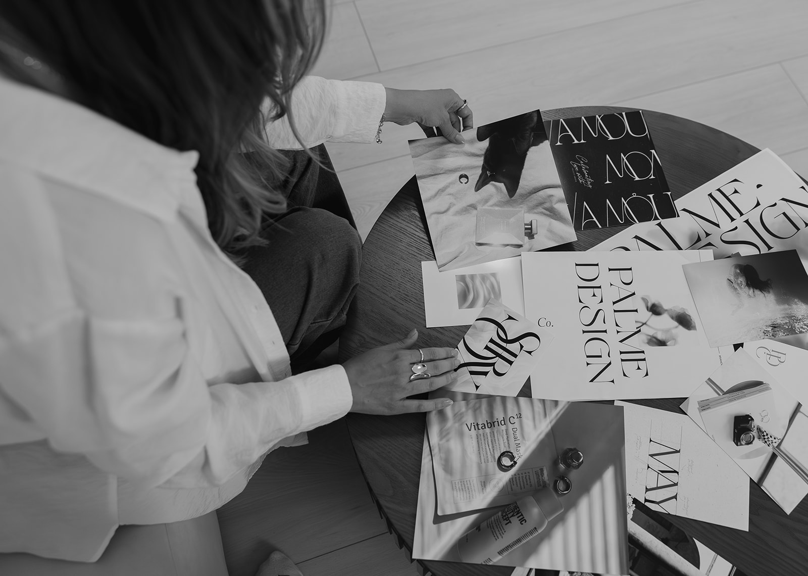
The best brands are built from a wide range of inspiration, not a 1 for 1 recreation of another photographer’s logo. Look beyond the photography industry entirely. Study fashion magazines, luxury packaging, fine art, editorial design, etc. Pull from multiple sources and different worlds. Let all of that inform something that is entirely, unmistakably yours.

Mistake #7 Underinvesting in Branding Then Wondering Why Clients Won’t Pay Premium Prices
This is the one that ties everything together.
You cannot charge luxury prices with a budget brand. It simply doesn’t work. Not because your work isn’t worth it, but because luxury clients make decisions based on feeling. And if your brand doesn’t feel premium, elevated, and intentional, the disconnect between your prices and your presentation will send them looking elsewhere.
Your brand is your first impression. In most cases, it’s the thing that determines whether a potential client reaches out at all. Before they’ve seen your full portfolio. Before they’ve read your about page. Before they’ve gotten on a call with you.
The photographers who consistently attract high end clients and book at premium prices aren’t just talented, they have brands that communicate their value before they ever say a word.
Investing in a professional high end branding isn’t an expense. It’s the thing that makes every other investment in your business (your education, your gear, your marketing) actually pay off.
Because when your brand finally reflects the caliber of your work, everything shifts. The right clients find you. They arrive already sold. And you stop having to convince anyone that you’re worth it.
Ready to Build High End Branding That Attracts Your Dream Clients?
If you recognized yourself in any of these mistakes, that’s not a bad thing. It means you’re paying attention. And it means you know what needs to change.
We work with wedding photographers who are ready for high end branding that actually reflects the caliber of their work… one that attracts elevated clients, supports premium pricing, and makes them proud every single time they share their website link.
If that’s you, I’d love to chat.
You Might Also Love
5 Signs Your Photographer Branding Is Holding You Back
How to Create a Mood Board for Your Photography Brand
Fonts for Photographers: 5 Typography Trends Fine-Art Photographers Need to Know in 2026
Photography Branding for Wedding Photographers: Lindsay Monahan Photography


Inside this guide I will give you actionable, step-by-step tips that you can implement in your website right away to lay a strong SEO foundation and start seeing better SEO results so you can get organic leads to your site so qualified potential leads can easily find you on Google.
easy SEO Guide To help you have a good seo foundation to Get Your Site Found on Google
free download


